1
2
3
4
5
6
7
8
9
10
11
12
13
14
15
16
17
18
19
20
21
22
23
24
25
26
27
28
29
30
31
32
33
34
35
36
37
38
39
40
41
42
43
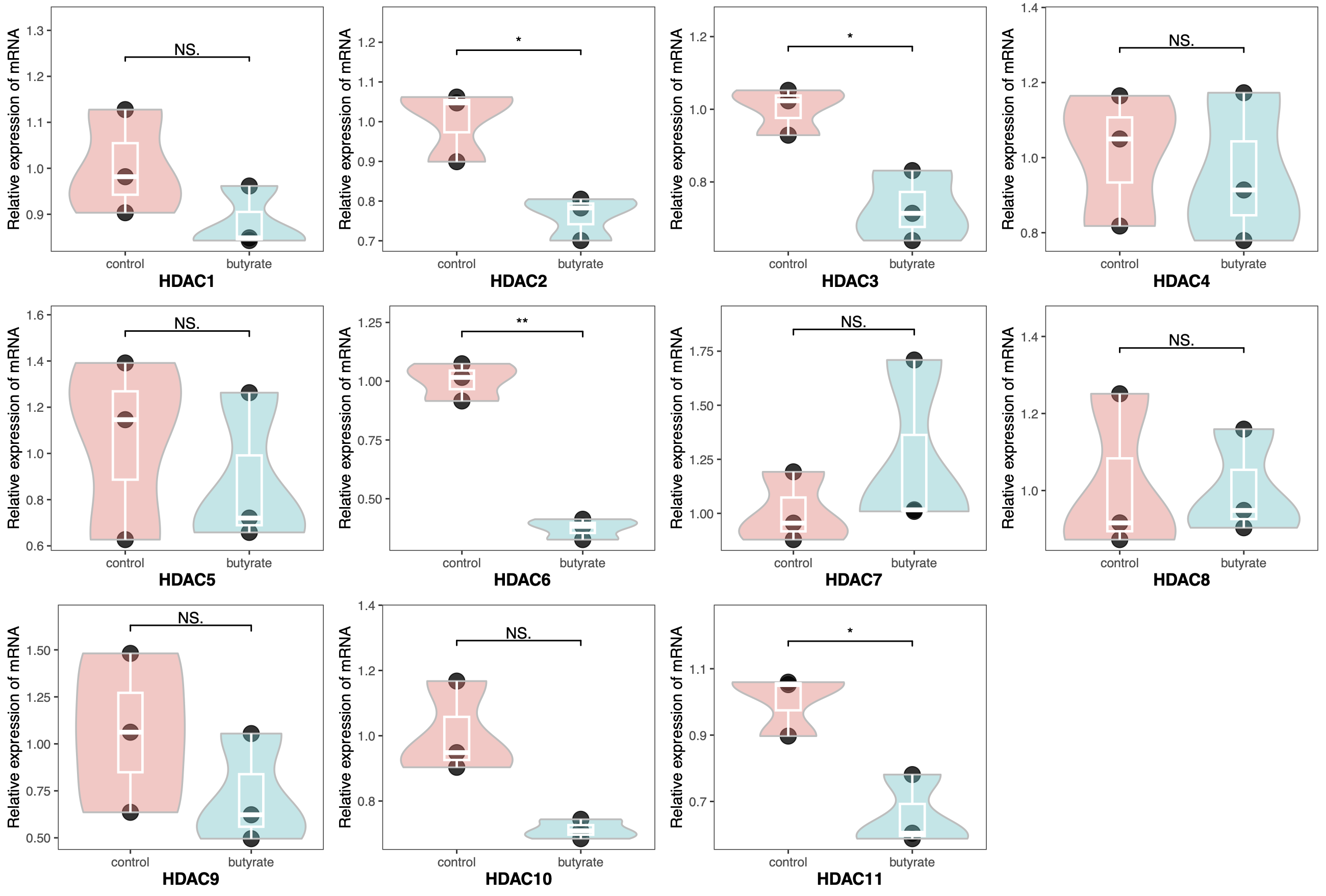
| library(readxl)
library(tidyverse)
library(ggpubr)
library(gridExtra)
pcr <- read_xlsx("qrt-pcr.xlsx")
pcr$Group <- factor(pcr$Group, levels = c("control", "butyrate"))
pcr$Gene <- factor(pcr$Gene, levels = paste0("HDAC", 1:11))
HDAC <- paste0("HDAC", 1:11)
plots <- list()
for (i in HDAC) {
plots[[i]] <- ggplot(pcr[pcr$Gene == i, ], aes(x = Group, y = Expression)) +
geom_point(color="black",
size=5, alpha = 0.8)+
geom_violin(aes(fill = Group),
color = "gray", alpha = 0.4,
scale = "width",
linewidth = 0.6,
trim = T)+
geom_boxplot(color = "white",
outlier.color = "black",
width = 0.2,
size = 0.8,
fill = NA) +
geom_signif(comparisons = list(c("control", "butyrate")),
y_position = max(pcr[pcr$Gene == i, ]$Expression+0.1),
map_signif_level = T,
test = "t.test",
textsize = 4) +
guides(fill = "none")+
theme_bw()+
labs(x = i, y = "Relative expression of mRNA")+
ylim(NA, max(pcr[pcr$Gene == i, ]$Expression+0.2)) +
theme(axis.title.x = element_text(size = 12, face = "bold"),
panel.grid = element_blank())
}
do.call("grid.arrange", c(plots, ncol=4))
|