1
2
3
4
5
6
7
8
9
10
11
12
13
14
15
16
17
18
19
20
21
22
23
24
25
26
27
28
29
30
31
32
33
34
35
36
37
38
39
40
41
42
43
44
45
46
47
48
49
50
51
|
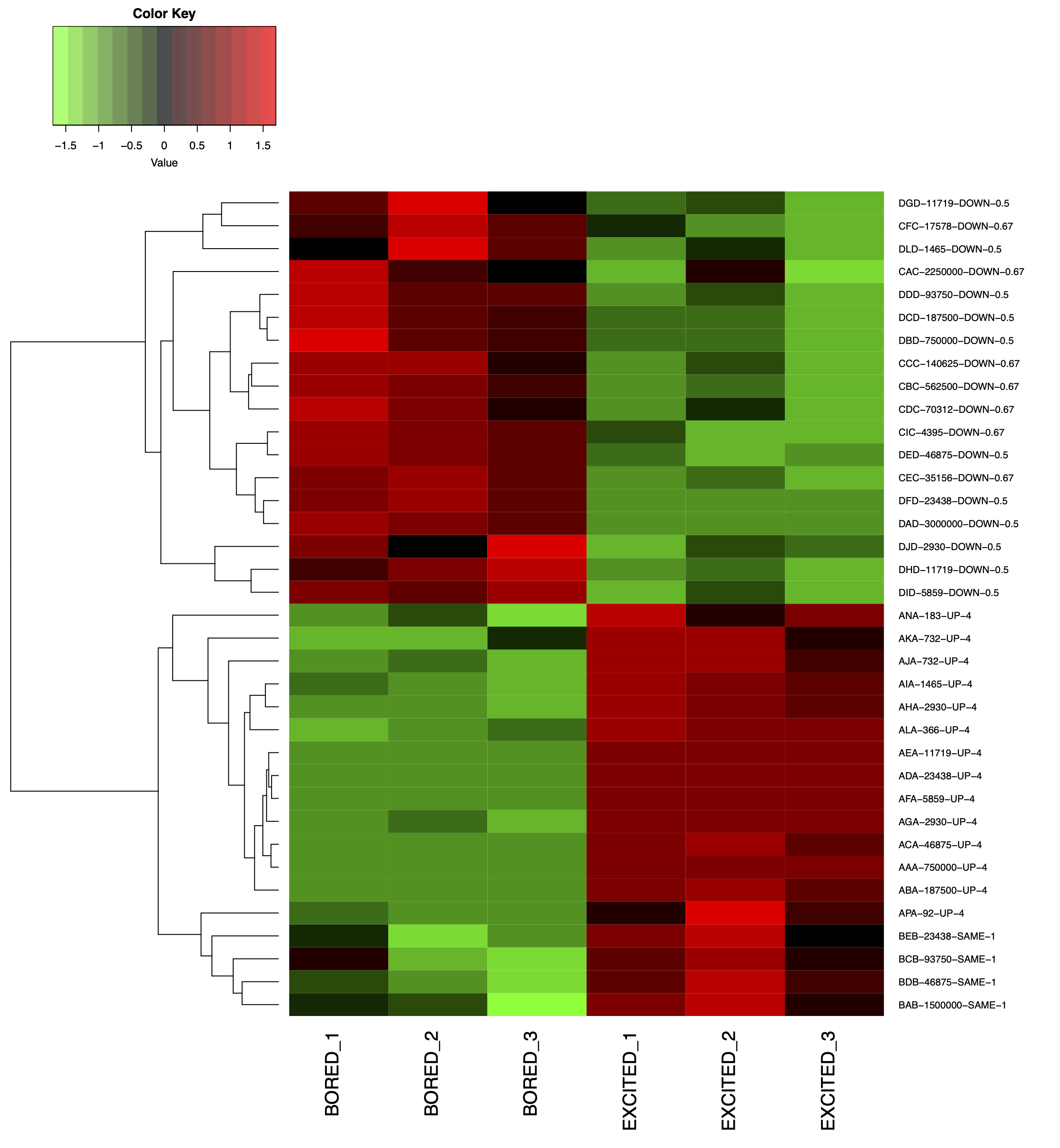
rm(list = ls())
library(pheatmap)
data <- as.matrix(read.table("data.txt",row.names = 1,header = T,sep = "\t"))
annotation_col = data.frame(CellType = factor(c("A","B","C","D","E",
"F","G","H","I","J")))
rownames(annotation_col) <- colnames(data)
head(annotation_col)
ann_colors = list(
CellType = c(A = "#65B99F", B = "#F08961", C = "#8A9BC3", D = "#DA85B5", E = "#A1CC56",
F = "#F5D239", G = "#7CC07B", H = "#BAABD0", I = "#3766A4", J = "#DF3078"))
head(ann_colors)
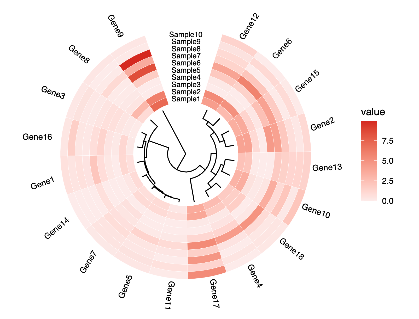
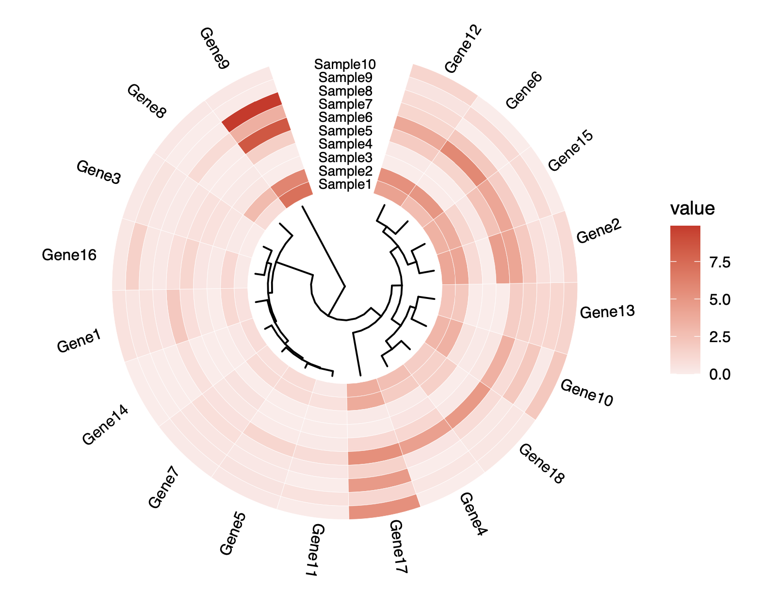
pheatmap(data,
cluster_cols = FALSE,
cluster_rows = FALSE,
annotation_col = annotation_col,
annotation_colors = ann_colors,
color = colorRampPalette(c("#FDEBEA","#D5281F"))(100),
fontsize_col = 8,
fontsize_row = 10,
show_colnames = F,
cellwidth = 30,
cellheight = 24,
display_numbers = TRUE,number_color = "black",
main = "Heatmap")
|