ggplot2包

ggplot2包
泡泡准备
所需R包
{ggplot2}, part of the {tidyverse} package collection
{tidyverse} package collection, namely
{dplyr} for data wrangling
{tibble} for modern data frames
{tidyr} for data cleaning
{forcats} for handling factors
{corrr} for calculating correlation matrices
{cowplot} for composing ggplots
{ggforce} for sina plots and other cool stuff
{ggrepel} for nice text labeling
{ggridges} for ridge plots
{ggsci} for nice color palettes
{ggtext} for advanced text rendering
{ggthemes} for additional themes
{grid} for creating graphical objects
{gridExtra} for additional functions for “grid” graphics
{patchwork} for multi-panel plots
{prismatic} for manipulating colors
{rcartocolor} for great color palettes
{scico} for perceptional uniform palettes
{showtext} for custom fonts
{shiny} for interactive apps a number of packages for interactive visualizations
{charter}
{echarts4r}
{ggiraph}
{highcharter}
{plotly}
1 | # install CRAN packages |
数据集
本教程中使用来自空气污染致发病率和死亡率研究(nmaps)的数据。为了使作图易于管理,我们将数据限制在芝加哥1997-2000年间。关于这个数据集的更多细节,请参考Roger Peng的书《环境流行病学中的统计方法》。
我们能够使用{readr} 包中的read_csv() 函数将数据导入R,并通过箭头<- 将数据赋值给变量chic 。1
chic <- readr::read_csv("https://raw.githubusercontent.com/z3tt/ggplot-courses/main/data/chicago-nmmaps-custom.csv")
其中 :: 被称为namespace,可以不加载R包就可以使用函数,也可以先加载R包library(readr) ,再使用函数chic<-read.csv(...) 。
1 | tibble::glimpse(chic) |
1 | head(chic, 10) |
1 | ## # A tibble: 10 × 11 |
ggplot包
ggplot是一个基于图形语法的声明式创建图形系统。你提供数据,告诉ggplot如何将ggplot映射变量到美学(aestheics),使用哪些基本图形基元,它处理细节。
ggplot基本元素
Data: 想去画图的原始数据。
Geometries geom: 数据呈现的几何形状。
Aesthetics aes(): 几何和统计对象的美学,例如位置、颜色、大小、形状、透明度。
Scales scale: 数据和美学维度的映射,例如从数据范围到图形宽度、因子到图形颜色。
Statistical transformations stat: 数据吨统计,例如百分位、拟合曲线、加和。
Coordinate system coord: 数据的转换。
Facets facet_: 数据图表的排列。
Visual themes theme(): 主题的视觉默认值,例如背景、网格、轴、默认字体、大小、颜色。
ggplot基础
首先我们需要加载ggplot2 ,另外也能使用tidyverse包 进行加载。1
2library(ggplot2)
# library(tidyverse)
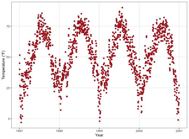
ggplot2的语法是不同于base R,默认的ggplot需要三样东西:数据(data)、美学(aesthetics)和几何图形(geometry)。我们总是通过ggplot(data = df)去定义一个图形对象,告诉ggplot我们要使用这个数据进行工作。多数情况下,你可能想画两个变量,一个X轴、一个Y轴。这些是位置美学,因此我们添加aes(x = var1, y = var2)到ggplot(是的,aes代表美学)。然而,有些时候,我们可能需要指定一个或三个及以上个变量。
💡我们在aes()外部指定数据,在内部映射变量
在此,我们将变量date映射到X轴,将变量temp映射到Y轴,然后,我们也能将变量映射到其他美学,比如颜色、大小和形状。
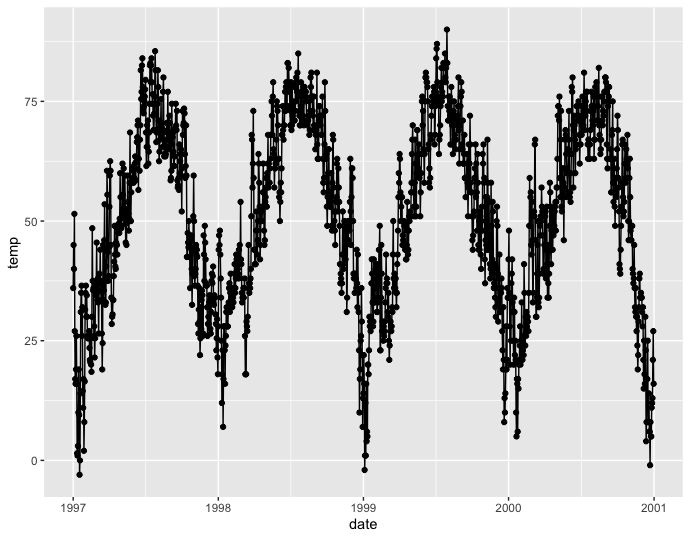
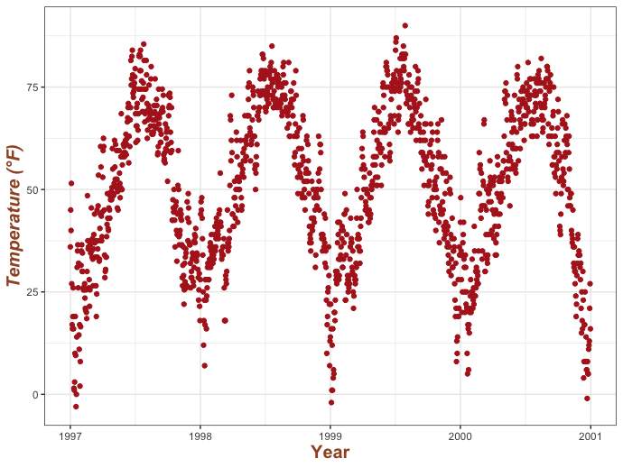
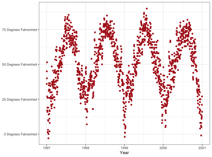
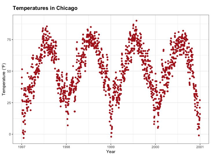
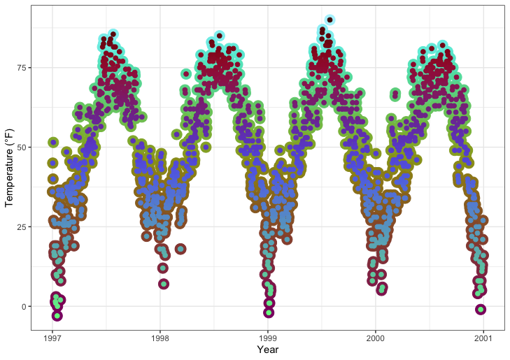
1 | (g <- ggplot(chic, aes(x = date, y = temp))) |
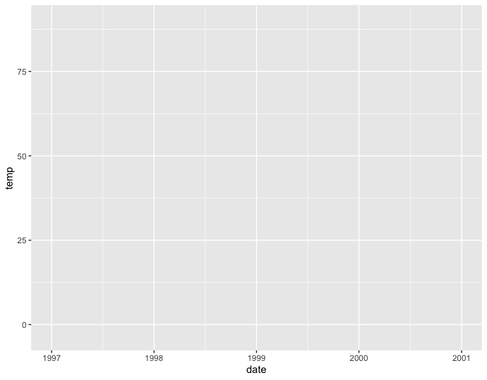
啊!仅仅创建了一个面板。为什么?这是因为ggolot2不知道如何去画这个图形—-我们需要指定一个几何图形。
ggplot允许你将最近创建的ggobjict赋值给一个自定义变量,本例中称为g,你也能将这个ggobject添加其他的层,要么一次性添加所有层,要么赋值它给相同或不同的变量进而分多次添加。
💡将一个图形分配给对象时,默认使用括号,这个图形会立刻显示出来。即使用(g <- ggplot(…))代替g <- ggplot()。
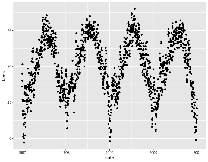
有很多很多的几何图形(称为geoms,因为每一个函数都以geom_开头)默认能够添加到ggplot,甚至还有很多的扩展包可以被添加。让我们告诉ggplot我们想使用哪种风格的图形吧,例如使用geom_point()创建一个散点图。
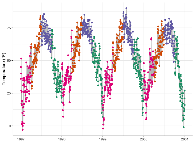
1 | g + geom_point() |
非常好!我们也可以将图形变为线形(不是最好的,但人总是这样),所以使用geom_line()来看看吧。
1 | g + geom_line() |

我们也能结合几个几何图形层—-这将是神奇和有趣的开始。1
g + geom_line() + geom_point()
调整几何图形的属性
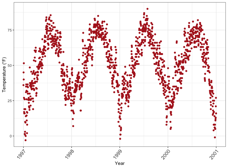
在geom_* 命令中可以熟练操作视觉美学,例如点的颜色、形状、大小。让我们将所有的点转化为大大火红色钻石!1
g + geom_point(color = "firebrick", shape = "diamond", size = 2)
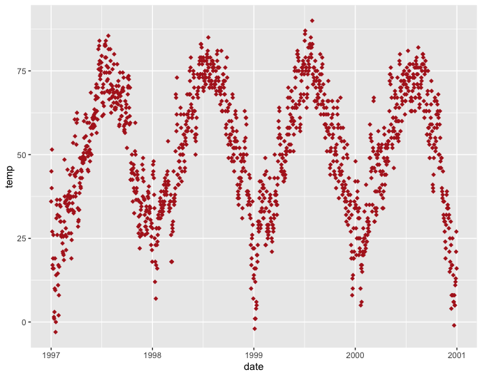
💡 ggplot 能够同时识别color和colour,也可以使用简写版本col。
你能使用预设颜色或十六进制颜色代码,可以同时使用,甚至可以通过rgb()函数使用RGB/RGBA颜色。
每个geom都有自己的属性(称为参数),相同的参数可能导致不同的变化,这取决于你使用的geom。
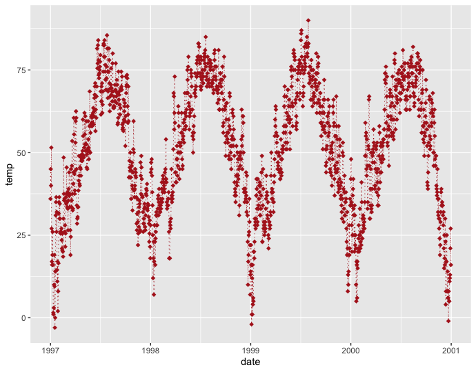
1 | g + geom_point(color = "firebrick", shape = "diamond", size = 2) + |
ggplot默认主题替换
为了进一步说明ggplot的多用途性,让我们通过设置一个不同的内置主题(例如theme_bw())来摆脱灰色的默认ggplot2外观—-通过调用theme_set()。
1 | theme_set(theme_bw()) |

💡 theme()是一个基本的命令,能够修改所有的主题参数(文本、矩形和线)。
坐标轴
调整坐标轴标题
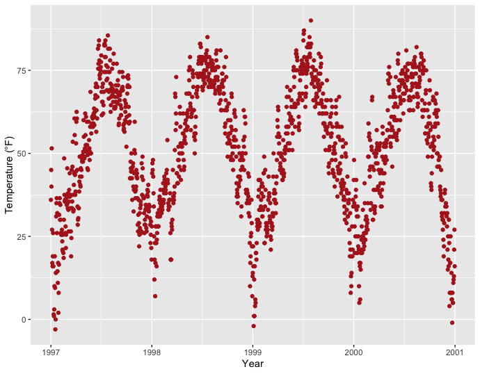
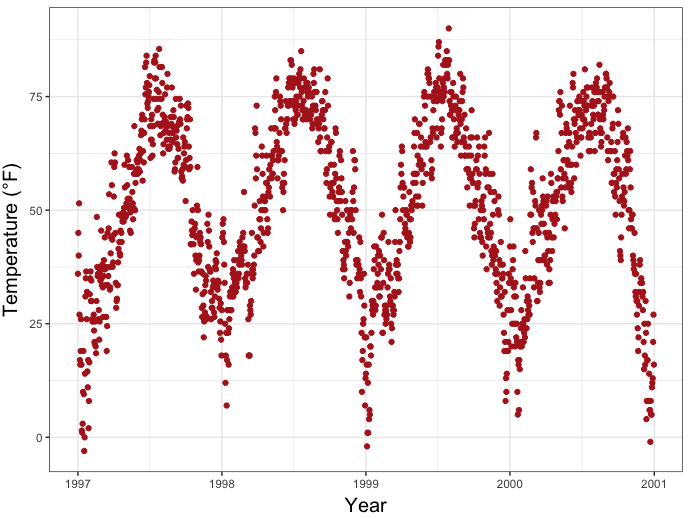
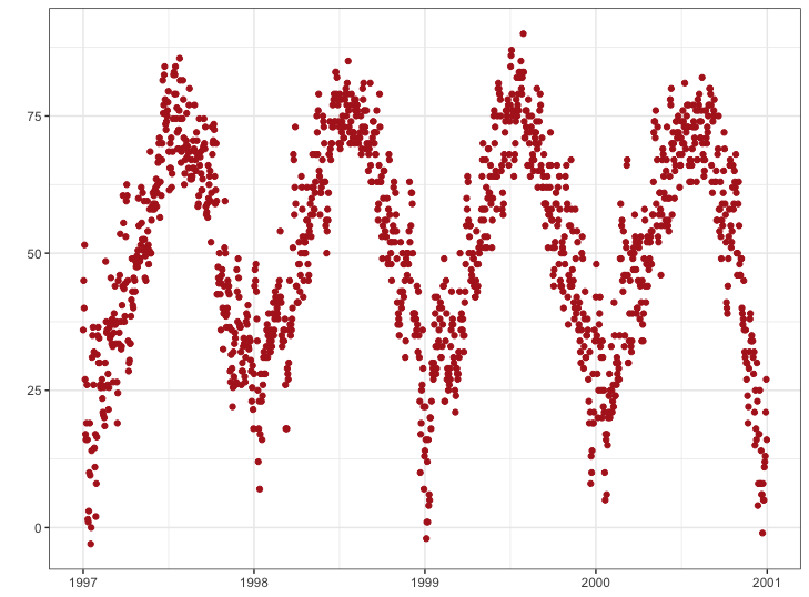
我们使用labs() 为坐标轴(这里是x和y)指定一个字符串,来调整坐标轴标题。1
2
3ggplot(chic, aes(x = date, y = temp)) +
geom_point(color = "firebrick") +
labs(x = "Year", y = "Temperature (°F)")
🧑🎄你也可以使用 xlab() 或 ylab() 分别对坐标轴标题进行修改。
1 | ggplot(chic, aes(x = date, y = temp)) + |
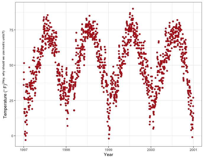
通常你也可以通过添加符号本身来指定符号(这里是“°”),但下面的代码不仅允许添加符号,还可以添加上标:1
2
3ggplot(chic, aes(x = date, y = temp)) +
geom_point(color = "firebrick") +
labs(x = "Year", y = expression(paste("Temperature (", degree ~ F, ")"^"(Hey, why should we use metric units?!)")))
增加坐标轴和坐标轴标题之间的距离
theme() 是修改特定主题元素(文本、标题、方框、符号、背景,...)的基本命令。我们会经常使用他们!现在,我们可以通过在theme()调用中覆盖默认的element_text()来改变所有或特定文本元素的属性(这里是轴标题):1 | ggplot(chic, aes(x = date, y = temp)) + |
1 | ggplot(chic, aes(x = date, y = temp)) + |

margin()对象中的标签t和r分别指向顶部和右侧。您还可以将四个边距指定为margin(t, r, b, l)。请注意,我们现在必须更改右边距来修改y轴上的空间,而不是底部边距。
💡记住边顺序的一个好方法是‘t-r-ou-b-l-e’。
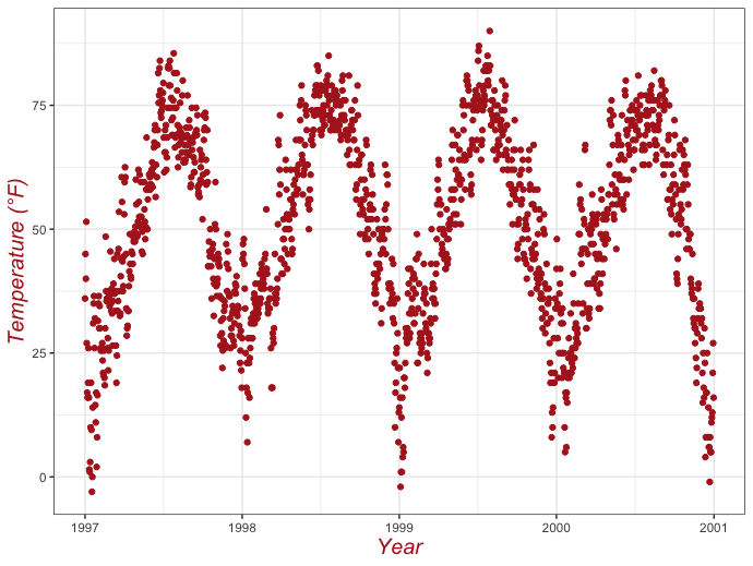
改变坐标轴标题美学
同样,我们使用 theme() 函数修改元素 axis.title 和/或下级元素 axis.title.x 和axis.title.y 。在element_text() 中,我们可以覆盖默认的size 、color 和face :1
2
3
4
5ggplot(chic, aes(x = date, y = temp)) +
geom_point(color = "firebrick") +
labs(x = "Year", y = "Temperature (°F)") +
theme(axis.title = element_text(size = 15, color = "firebrick",
face = "italic"))
1 | ggplot(chic, aes(x = date, y = temp)) + |
🧝你也可以使用axis.ttile和axis.title.y。因为axis.title.x会使用来自axis.title的值。展开查看示例:
1 | ggplot(chic, aes(x = date, y = temp)) + |
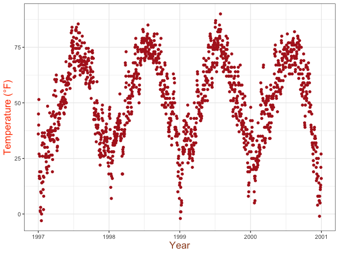
坐标轴标题和其他属性可以一次性修改,也可以单独进行修改:1
2
3
4
5ggplot(chic, aes(x = date, y = temp)) +
geom_point(color = "firebrick") +
labs(x = "Year", y = "Temperature (°F)") +
theme(axis.title = element_text(color = "sienna", size = 15, face = "bold"),
axis.title.y = element_text(face = "bold.italic"))
改变坐标轴文本美学
同样,你也可以使用axis.text 和/或下级元素axis.text.x 和axis.text.y 去改变坐标轴文本的外观(这里是数字):1
2
3
4
5ggplot(chic, aes(x = date, y = temp)) +
geom_point(color = "firebrick") +
labs(x = "Year", y = "Temperature (°F)") +
theme(axis.text = element_text(color = "dodgerblue", size = 12),
axis.text.x = element_text(face = "italic"))

旋转坐标轴文本
通过指定角度,可以旋转任何文本元素。使用 hjust 和 vjust 可以调整之后文本的水平位置(0 = 左,1 = 右)和垂直位置(0 = 上,1 = 下):1
2
3
4ggplot(chic, aes(x = date, y = temp)) +
geom_point(color = "firebrick") +
labs(x = "Year", y = "Temperature (°F)") +
theme(axis.text.x = element_text(angle = 50, vjust = 1, hjust = 1, size = 12))
移除坐标轴文本和刻度线
也许很少有理由这么做,但可能就是这样:1
2
3
4
5ggplot(chic, aes(x = date, y = temp)) +
geom_point(color = "firebrick") +
labs(x = "Year", y = "Temperature (°F)") +
theme(axis.ticks.y = element_blank(),
axis.text.y = element_blank())
💡如果你想去掉一个主题元素,总是使用element_bank() 。
移除坐标轴标题
我们能够再次使用theme_blank() ,但是使用labs() (xlab() )能够更简单的移除标签:1
2
3ggplot(chic, aes(x = date, y = temp)) +
geom_point(color = "firebrick") +
labs(x = NULL, y = "")
💡请注意,NULL 会删除元素(与 element_blank() 类似),而空引号””将保留轴标题的间距,并且不会打印任何内容。
限制坐标轴区间
有时,您想放大数据,仔细观察数据的某个范围。您可以在不对数据进行取子集的情况下做到这一点:1
2
3
4ggplot(chic, aes(x = date, y = temp)) +
geom_point(color = "firebrick") +
labs(x = "Year", y = "Temperature (°F)") +
ylim(c(0, 50))
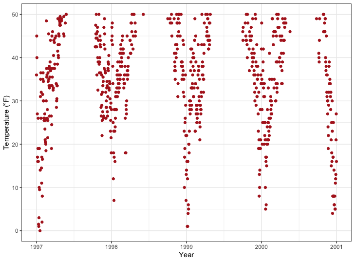
或者你能使用scale_y_continuous(limits=c(0,50)) 或者coord_cartesian(ylim=c(0,50)) 。前者删除区域外的所有点,第二种调整可见区域,和ylim(c(0,50)) 类似。你可能会想:两个结果最后是一样的吗?其实是不一样的,会有一个重要的不同。比较接下来的两张图:
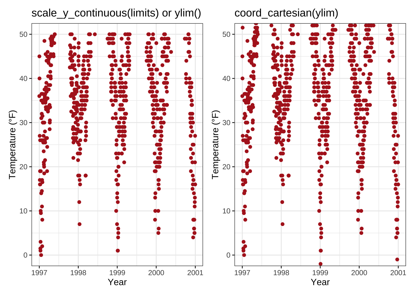
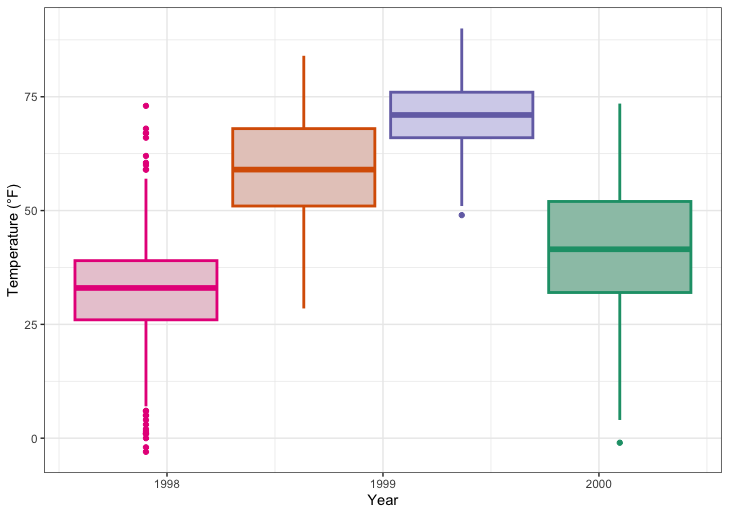
您可能已经发现,在左侧Y极限周围有一些空的缓冲区,而在右侧,绘制的点一直延伸到边界甚至更远。这完美地说明了子集(左)与缩放(右)的关系。为了说明这一点的重要性,让我们来看看另一种图表类型—箱形图:

呃,这是因为scale_x|y_continuous() 先对数据取子集,所以我们会得到完全不同的(而且是错误的,至少如果这不是你的目的的话)的盒图估计值!我希望您现在不必再回到您的旧脚本,检查您是否在绘图时篡改了数据,并在您的报告、论文或毕业论文中报告了错误的统计摘要…
强制从原点开始绘图
与此相关,您可以强制R从原点开始绘制图表:1
2
3
4
5
6
7chic_high <- dplyr::filter(chic, temp > 25, o3 > 20)
ggplot(chic_high, aes(x = temp, y = o3)) +
geom_point(color = "darkcyan") +
labs(x = "Temperature higher than 25°F",
y = "Ozone higher than 20 ppb") +
expand_limits(x = 0, y = 0)
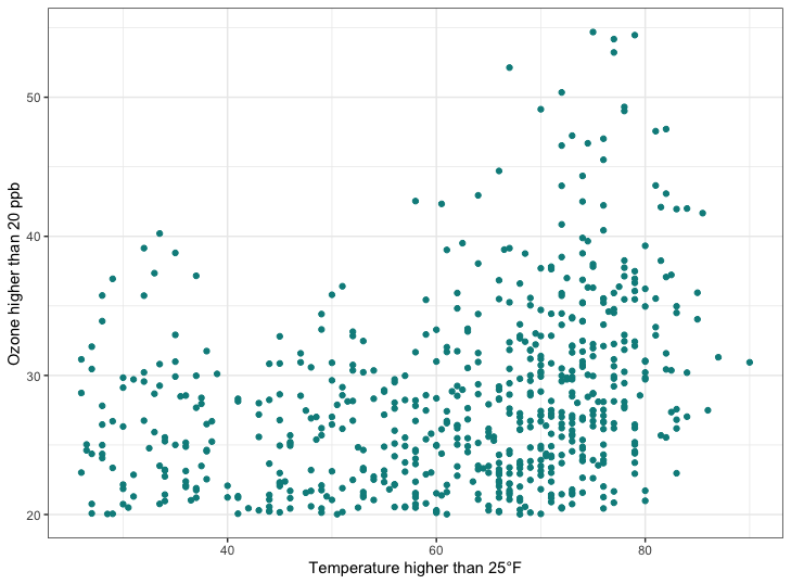
🧑🎄使用coord_cartesian也会产生相同的结果。展开查看示例:
1 | chic_high <- dplyr::filter(chic, temp > 25, o3 > 20) |
我们也能真正的强制从原点开始1
2
3
4
5
6ggplot(chic_high, aes(x = temp, y = o3)) +
geom_point(color = "darkcyan") +
labs(x = "Temperature higher than 25°F",
y = "Ozone higher than 20 ppb") +
expand_limits(x = 0, y = 0) +
coord_cartesian(expand = FALSE, clip = "off")
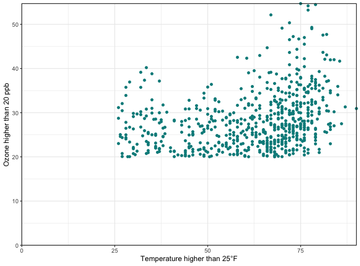
💡 在任何坐标系中,参数 clip = “off”总是以 coord_* 开始,允许在面板区域外绘制。
在这里,我调用它来确保 c(0, 0) 处的刻度线不会被剪切。更多详情,请参阅 Claus Wilke在Twitter上发布的主题。
相同缩放比例的坐标轴
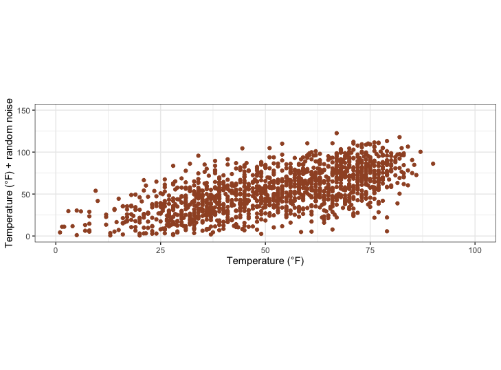
为了演示,让我们绘制带有随机噪音的温度与温度的对比图。coord_equal() 是一个具有指定比率的坐标系,该比率表示 y 轴上的单位数相当于 x 轴上的一个单位数。默认值为 ratio = 1,确保 x 轴上的一个单位与 y 轴上的一个单位长度相同:1
2
3
4
5ggplot(chic, aes(x = temp, y = temp + rnorm(nrow(chic), sd = 20))) +
geom_point(color = "sienna") +
labs(x = "Temperature (°F)", y = "Temperature (°F) + random noise") +
xlim(c(0, 100)) + ylim(c(0, 150)) +
coord_fixed()

比值大于 1 时,y 轴上的单位比 x 轴上的单位长,反之亦然:1
2
3
4
5ggplot(chic, aes(x = temp, y = temp + rnorm(nrow(chic), sd = 20))) +
geom_point(color = "sienna") +
labs(x = "Temperature (°F)", y = "Temperature (°F) + random noise") +
xlim(c(0, 100)) + ylim(c(0, 150)) +
coord_fixed(ratio = 1/5)
使用函数更改标签
有时,对标签稍作改动会很方便,比如添加单位或百分号,而不用将它们添加到数据中。在这种情况下,您可以使用函数:1
2
3
4ggplot(chic, aes(x = date, y = temp)) +
geom_point(color = "firebrick") +
labs(x = "Year", y = NULL) +
scale_y_continuous(label = function(x) {return(paste(x, "Degrees Fahrenheit"))})
标题
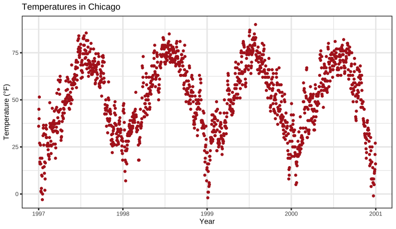
添加一个标题
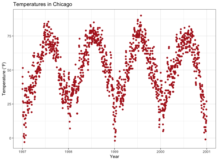
我们能够通过ggtitle() 函数添加一个标题1
2
3
4ggplot(chic, aes(x = date, y = temp)) +
geom_point(color = "firebrick") +
labs(x = "Year", y = "Temperature (°F)") +
ggtitle("Temperatures in Chicago")
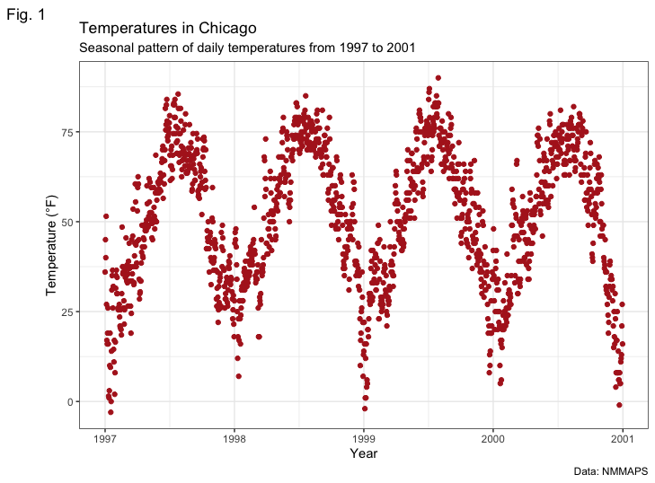
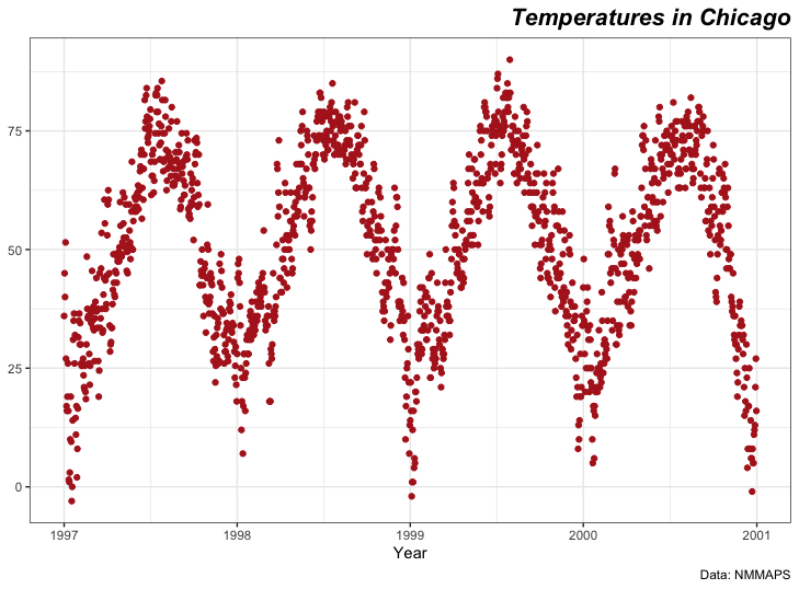
或者,你也能使用labs() 。在这里,您可以添加多个参数,例如额外的副标题、标题和标签(以及之前显示的轴标题):1
2
3
4
5
6
7ggplot(chic, aes(x = date, y = temp)) +
geom_point(color = "firebrick") +
labs(x = "Year", y = "Temperature (°F)",
title = "Temperatures in Chicago",
subtitle = "Seasonal pattern of daily temperatures from 1997 to 2001",
caption = "Data: NMMAPS",
tag = "Fig. 1")
标题加粗并在底线处添加空格
同样,由于我们要修改主题元素的属性,因此我们使用theme() 函数,并对文本元素axis.title 和axis.text 修改字体和边距。以下对主题元素的所有修改不仅适用于标题,也适用于所有其他标签,如plot.subtitle 、plot.caption 、plot.tag 、legend.title 、legend.text 以及 axis.title 和 axis.text 。
1 | ggplot(chic, aes(x = date, y = temp)) + |
💡 要记住边线参数的顺序,一个很好的方法是 “t-r-oub-l-e”,它类似于四边的第一个字母。
调整标题位置
通常情况下,对齐(左、中、右)是通过hjust (代表水平调整)进行调节。1
2
3
4
5
6ggplot(chic, aes(x = date, y = temp)) +
geom_point(color = "firebrick") +
labs(x = "Year", y = NULL,
title = "Temperatures in Chicago",
caption = "Data: NMMAPS") +
theme(plot.title = element_text(hjust = 1, size = 16, face = "bold.italic"))
当然,我们也有可能进行垂直方向的调整,其使用vjust 进行调整。
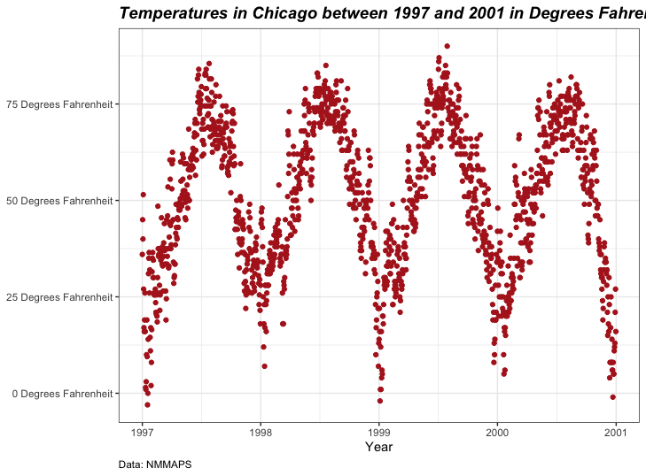
自 2019 年起,用户可以根据面板区域(默认)或 plot.title.position 和plot.caption.position 指定标题、副标题和标题的对齐方式。实际上,在大多数情况下,后者在设计上是更好的选择,许多人对这项新功能感到非常高兴,因为尤其是对于很长的 Y 轴标签,对齐方式看起来非常糟糕:1
2
3
4
5
6
7
8(g <- ggplot(chic, aes(x = date, y = temp)) +
geom_point(color = "firebrick") +
scale_y_continuous(label = function(x) {return(paste(x, "Degrees Fahrenheit"))}) +
labs(x = "Year", y = NULL,
title = "Temperatures in Chicago between 1997 and 2001 in Degrees Fahrenheit",
caption = "Data: NMMAPS") +
theme(plot.title = element_text(size = 14, face = "bold.italic"),
plot.caption = element_text(hjust = 0)))
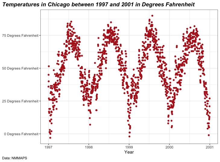
1 | g + theme(plot.title.position = "plot", |
标题中使用非传统字体
您还可以使用不同的字体,而不仅仅是 ggplot 提供的默认字体(不同操作系统提供的字体也不同)。有几个软件包可以帮助您使用安装在机器上的字体(您可能会在办公程序中使用这些字体)。在这里,我使用了showtext软件包,它可以让我们在R绘图中轻松使用各种类型的字体(TrueType、OpenType、Type 1、web fonts等)。加载软件包后,你还需要导入安装在设备上的字体。我经常使用Google字体,这些字体可以通过函数font_add_google() 导入,但也可以通过font_add() 添加其他字体。请注意,即使使用Google字体,也必须安装字体并重启Rstudio才能使用。1
2
3
4
5library(showtext)
font_add_google("Gochi Hand", "gochi")
font_add_google("Schoolbell", "bell")
font_add_google("Covered By Your Grace", "grace")
font_add_google("Rock Salt", "rock")
现在,我们可以使用—是的,你猜对了—theme() 来使用这些字体家族:1
2
3
4
5
6
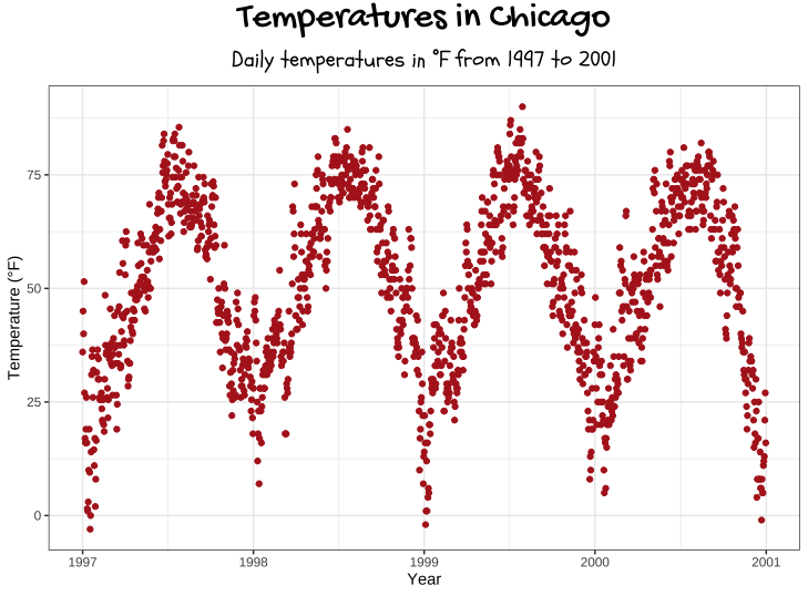
7ggplot(chic, aes(x = date, y = temp)) +
geom_point(color = "firebrick") +
labs(x = "Year", y = "Temperature (°F)",
title = "Temperatures in Chicago",
subtitle = "Daily temperatures in °F from 1997 to 2001") +
theme(plot.title = element_text(family = "gochi", hjust = .5, size = 25),
plot.subtitle = element_text(family = "bell", hjust = .5, size = 15))
您也可以为绘图中的所有文本元素设置非默认字体,详情请参阅 “主题 “部分。我将使用 Roboto Condensed 作为以下所有绘图的新字体。1
2font_add_google("Roboto Condensed", "Roboto Condensed")
theme_set(theme_bw(base_size = 12, base_family = "Roboto Condensed"))
(之前,本教程使用的是{extrafont}软件包,它在去年之前一直做得很好。突然间,我再也不能添加任何新字体了,而且在换了新笔记本电脑后,软件包根本找不到任何字体……现在我通常建议使用{ragg}软件包。不过,我没能让它在我的主页上发挥作用,所以我使用了{showtext}软件包,它也很不错,唯一的主要区别是,你需要用{showtext}明确导入你想使用的字体。不过,{showtext}似乎并不能很好地解决一些技术细节问题,所以你可能会在万不得已的情况下才使用这个软件包()。
更改多行文本的间距
你可以使用lineheight 参数来改变行间距。在本例中,我将行距压缩到了一起(lineheight < 1)。1
2
3
4
5ggplot(chic, aes(x = date, y = temp)) +
geom_point(color = "firebrick") +
labs(x = "Year", y = "Temperature (°F)") +
ggtitle("Temperatures in Chicago\nfrom 1997 to 2001") +
theme(plot.title = element_text(lineheight = .8, size = 16))

图例
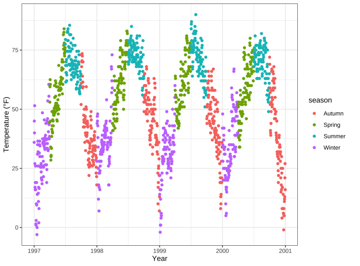
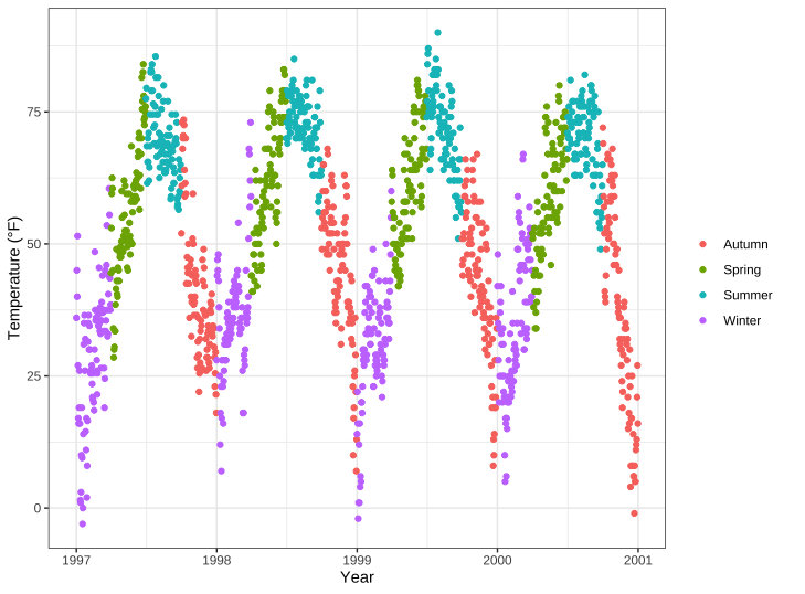
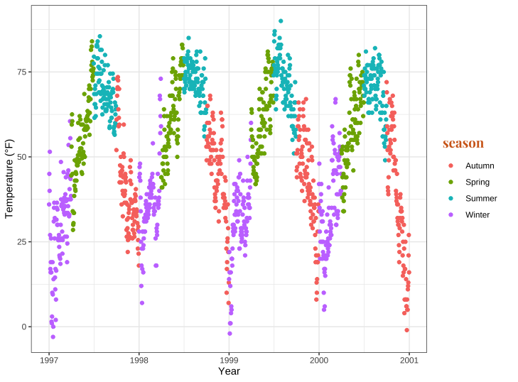
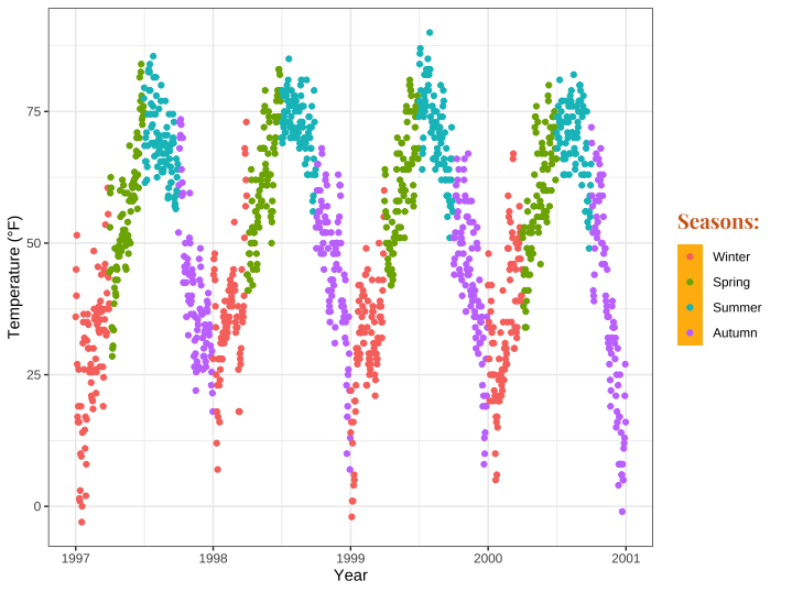
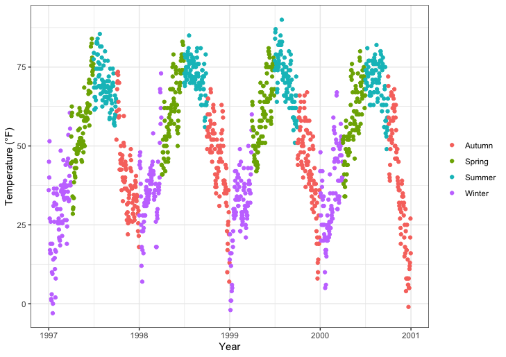
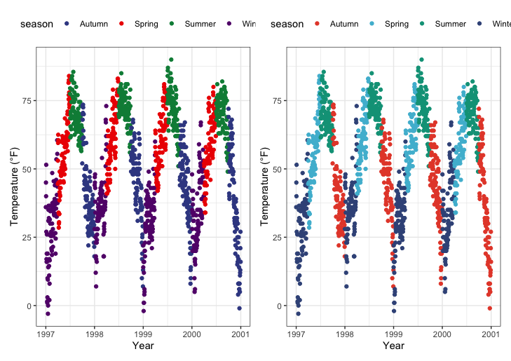
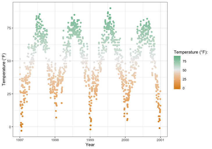
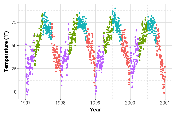
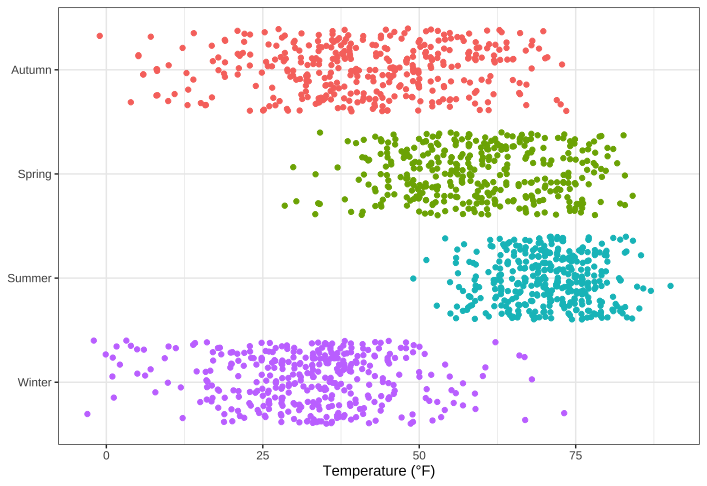
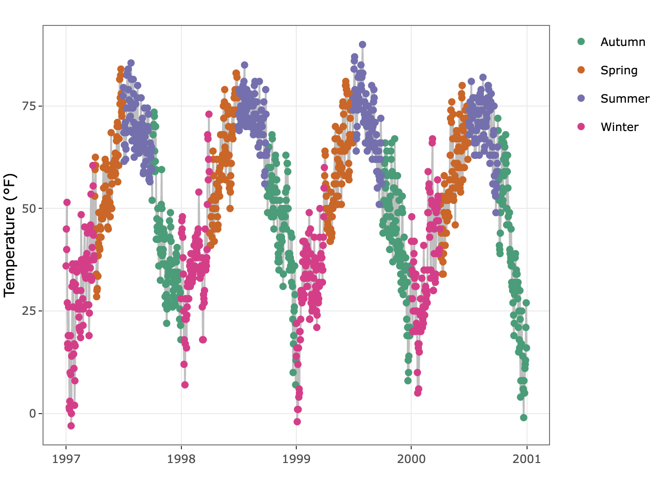
我们将根据季节对绘图进行颜色编码。或者用更像ggplot的方式来表述:我们将season变量映射为美学颜色。{ggplot2}的一个优点是,在将变量映射到美学颜色时,它会默认添加一个图例。你可以看到,默认情况下,图例标题是我们在颜色参数中指定的:1
2
3
4ggplot(chic,
aes(x = date, y = temp, color = season)) +
geom_point() +
labs(x = "Year", y = "Temperature (°F)")
关闭图例
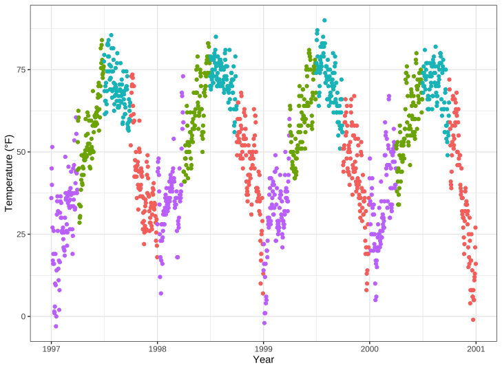
第一个问题总是:”如何才能去掉图例?
它是很简单的,总是使用theme(legend.position=none) 1
2
3
4
5ggplot(chic,
aes(x = date, y = temp, color = season)) +
geom_point() +
labs(x = "Year", y = "Temperature (°F)") +
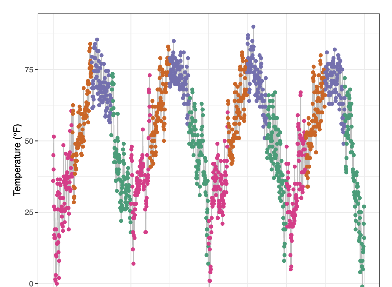
theme(legend.position = "none")
你也能根据实际情况使用guides(color=none) 或者scale_color_discrete(guide=none) 。更改主题元素会一次性删除所有图例,而使用后一种选项则可以删除特定图例,同时保留其他一些图例:1
2
3
4
5
6ggplot(chic,
aes(x = date, y = temp,
color = season, shape = season)) +
geom_point() +
labs(x = "Year", y = "Temperature (°F)") +
guides(color = "none")
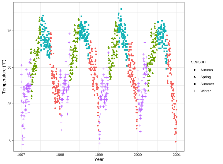
例如,在这里,我们保留了形状的图例,而丢弃了颜色的图例。
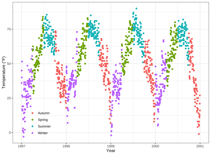
移除图例标题
我们早已学到的,使用element_blank() :1
2
3
4ggplot(chic, aes(x = date, y = temp, color = season)) +
geom_point() +
labs(x = "Year", y = "Temperature (°F)") +
theme(legend.title = element_blank())
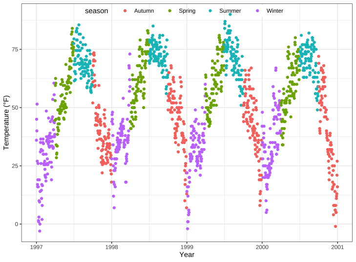
你也可以使用图例名为NULL来实现相同的效果,通过scale_color_discrete(name=NULL)或labs(color = NULL)。展开查看示例:
1 | ggplot(chic, aes(x = date, y = temp, color = season)) + |
1 | ggplot(chic, aes(x = date, y = temp, color = season)) + |
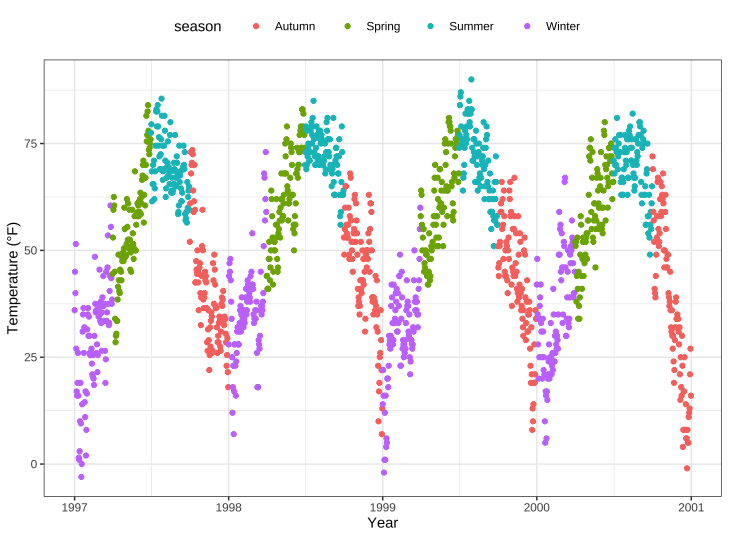
改变图例位置
如果不想将图例放在右侧,可以使用 legend.position 作为主题参数。可能的位置有 “顶部”、”右侧”(默认)、”底部 “和 “左侧”。1
2
3
4ggplot(chic, aes(x = date, y = temp, color = season)) +
geom_point() +
labs(x = "Year", y = "Temperature (°F)") +
theme(legend.position = "top")
您也可以通过指定一个具有相对 x 和 y 坐标的向量,将图例置于面板内部,该向量的范围为 0(左侧或底部)到 1(右侧或顶部):1
2
3
4
5
6ggplot(chic, aes(x = date, y = temp, color = season)) +
geom_point() +
labs(x = "Year", y = "Temperature (°F)",
color = NULL) +
theme(legend.position = c(.15, .15),
legend.background = element_rect(fill = "transparent"))
在这里,我还用透明填充覆盖了默认的白色图例背景,以确保图例不会隐藏任何数据点。
改变图例方向
如您所见,图例方向默认为垂直,但选择 “顶部 “或 “底部 “位置时,图例方向则为水平。不过,您也可以随意切换方向:1
2
3
4
5
6ggplot(chic, aes(x = date, y = temp, color = season)) +
geom_point() +
labs(x = "Year", y = "Temperature (°F)") +
theme(legend.position = c(.5, .97),
legend.background = element_rect(fill = "transparent")) +
guides(color = guide_legend(direction = "horizontal"))
改变图例标题风格
你也可以通过主题元素legend.title 调整图例标题外观:1
2
3
4
5
6ggplot(chic, aes(x = date, y = temp, color = season)) +
geom_point() +
labs(x = "Year", y = "Temperature (°F)") +
theme(legend.title = element_text(family = "Playfair",
color = "chocolate",
size = 14, face = "bold"))
改变图例标题
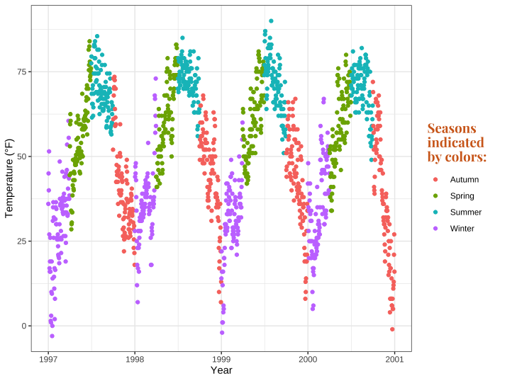
更改图例标题的最简单方法是使用labs() 图层:1
2
3
4
5
6
7ggplot(chic, aes(x = date, y = temp, color = season)) +
geom_point() +
labs(x = "Year", y = "Temperature (°F)",
color = "Seasons\nindicated\nby colors:") +
theme(legend.title = element_text(family = "Playfair",
color = "chocolate",
size = 14, face = "bold"))
可通过 scale_color_discrete(name = “title”) 或 guides(color = guide_legend(“title”))更改图例细节:1
2
3
4
5
6
7ggplot(chic, aes(x = date, y = temp, color = season)) +
geom_point() +
labs(x = "Year", y = "Temperature (°F)") +
theme(legend.title = element_text(family = "Playfair",
color = "chocolate",
size = 14, face = "bold")) +
scale_color_discrete(name = "Seasons\nindicated\nby colors:")
改变图例顺序
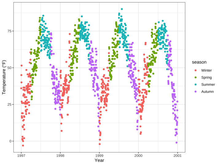
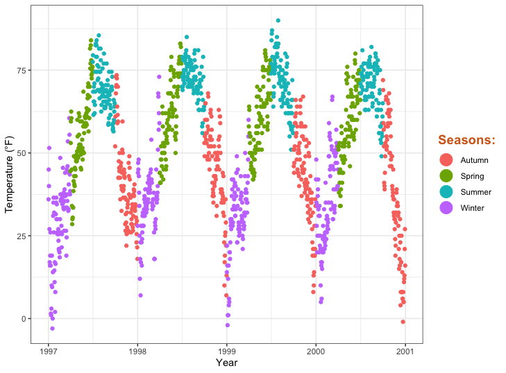
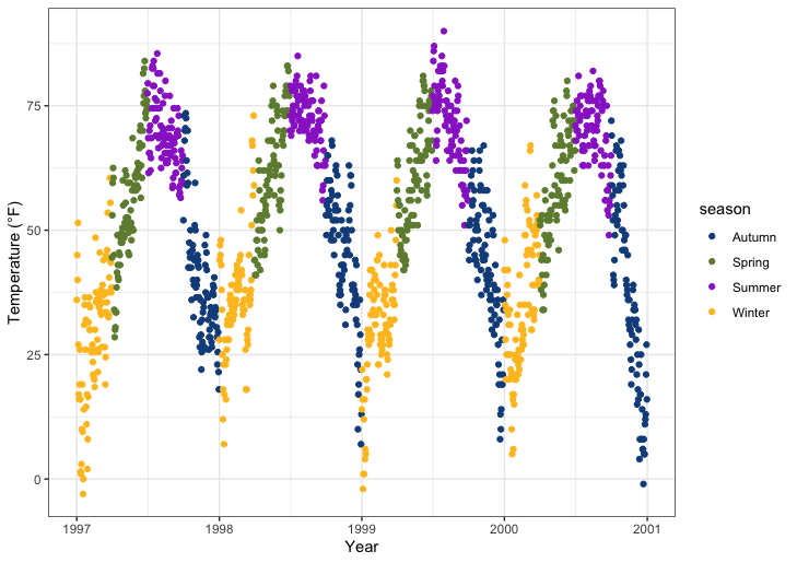
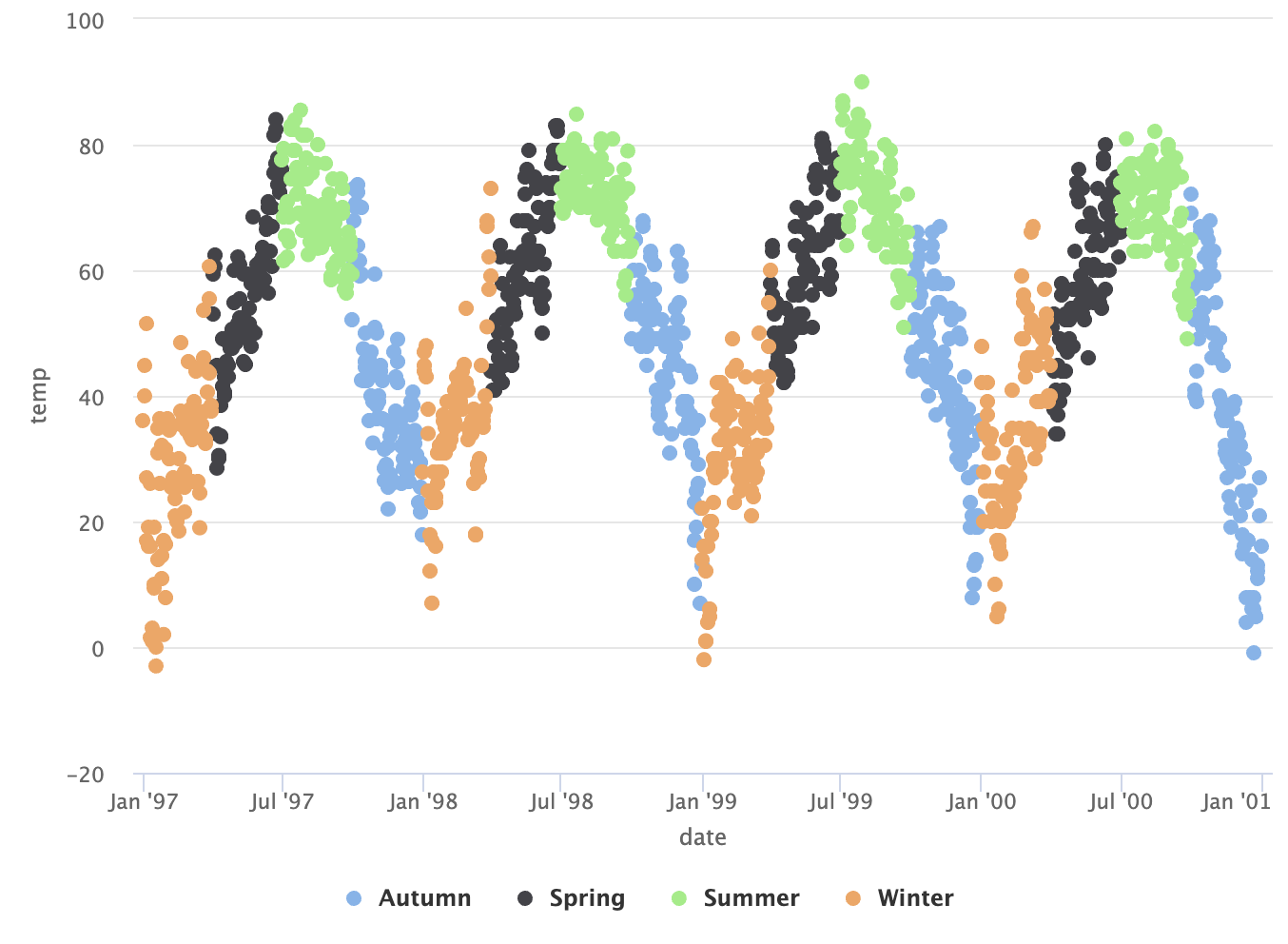
我们能够通过改变season levels完成这个目的。1
2
3
4
5
6
7chic$season <-
factor(chic$season,
levels = c("Winter", "Spring", "Summer", "Autumn"))
ggplot(chic, aes(x = date, y = temp, color = season)) +
geom_point() +
labs(x = "Year", y = "Temperature (°F)")
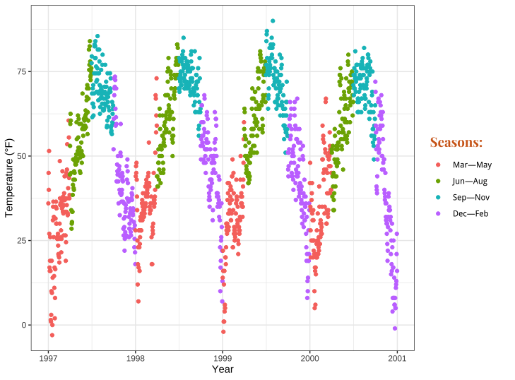
改变图例标签
我们将通过在scale_color_discrete() 调用中提供一个名称向量,用months来替换seasons:1
2
3
4
5
6
7
8
9
10ggplot(chic, aes(x = date, y = temp, color = season)) +
geom_point() +
labs(x = "Year", y = "Temperature (°F)") +
scale_color_discrete(
name = "Seasons:",
labels = c("Mar—May", "Jun—Aug", "Sep—Nov", "Dec—Feb")
) +
theme(legend.title = element_text(
family = "Playfair", color = "chocolate", size = 14, face = 2
))
更改图例中的背景框
要更改图例键的背景颜色(填充),我们需要调整主题元素legend.key 的设置:1
2
3
4
5
6
7
8ggplot(chic, aes(x = date, y = temp, color = season)) +
geom_point() +
labs(x = "Year", y = "Temperature (°F)") +
theme(legend.key = element_rect(fill = "darkgoldenrod1"),
legend.title = element_text(family = "Playfair",
color = "chocolate",
size = 14, face = 2)) +
scale_color_discrete("Seasons:")
如果想完全消除它们,请使用fill=NA 或fill=“transparent” 。
更改图例符号的大小
如果使用默认尺寸,图例中的点可能会有点模糊,尤其是在没有方框的情况下。要覆盖默认值,可以再次使用guides ,如下所示:1
2
3
4
5
6
7
8ggplot(chic, aes(x = date, y = temp, color = season)) +
geom_point() +
labs(x = "Year", y = "Temperature (°F)") +
theme(legend.key = element_rect(fill = NA),
legend.title = element_text(color = "chocolate",
size = 14, face = 2)) +
scale_color_discrete("Seasons:") +
guides(color = guide_legend(override.aes = list(size = 6)))
双层图例
比方说,您有两个不同的几何形状映射到同一个变量。例如,同一数据的点图层和轴须图层都以颜色为美学特征。默认情况下,点和 “线”都会这样出现在图例中:1
2
3
4ggplot(chic, aes(x = date, y = temp, color = season)) +
geom_point() +
labs(x = "Year", y = "Temperature (°F)") +
geom_rug()
你可以使用show.legend=FALSE 去掉一层图例1
2
3
4ggplot(chic, aes(x = date, y = temp, color = season)) +
geom_point() +
labs(x = "Year", y = "Temperature (°F)") +
geom_rug(show.legend = FALSE)

手动添加图例条目
{ggplot2}不会自动添加图例,除非你将美学(颜色、大小等)映射到变量上。不过,有时候我还是希望添加一个图例,这样就能清楚地知道你在绘制什么。
这里是默认图:
我们可以通过将guide映射到变量来强制生成图例。我们使用aes() 对线条和点进行映射,而且不是映射到数据集中的变量,而是映射到单个字符串(这样我们就能为每个字符串选择一种颜色)。1
2
3
4
5ggplot(chic, aes(x = date, y = o3)) +
geom_line(aes(color = "line")) +
geom_point(aes(color = "points")) +
labs(x = "Year", y = "Ozone") +
scale_color_discrete("Type:")
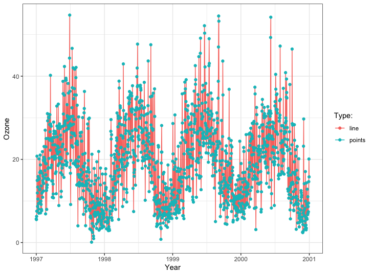
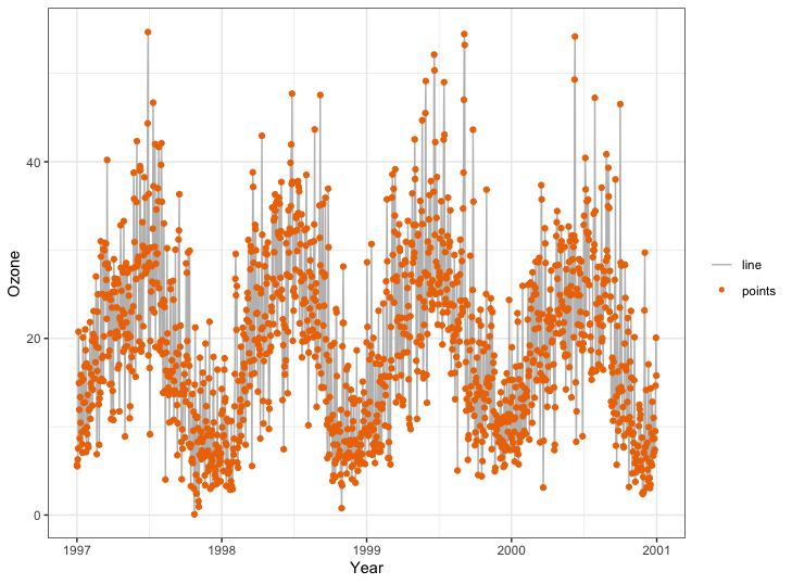
我们快成功了,但这不是我们想要的。我们想要灰色和红色!要改变颜色,我们可以使用scale_color_manual() 。此外,我们还可以使用guides() 函数覆盖图例美学。
好了!现在,我们已经绘制了一幅图,图例符号为灰色线和红色点,以及一条灰色线和一个红色点:1
2
3
4
5
6
7
8
9
10ggplot(chic, aes(x = date, y = o3)) +
geom_line(aes(color = "line")) +
geom_point(aes(color = "points")) +
labs(x = "Year", y = "Ozone") +
scale_color_manual(name = NULL,
guide = "legend",
values = c("points" = "darkorange2",
"line" = "gray")) +
guides(color = guide_legend(override.aes = list(linetype = c(1, 0),
shape = c(NA, 16))))
使用其他风格的图例
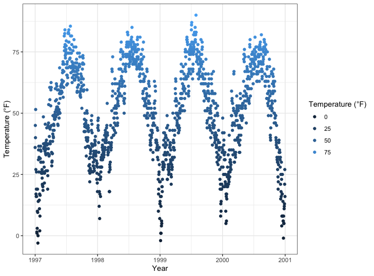
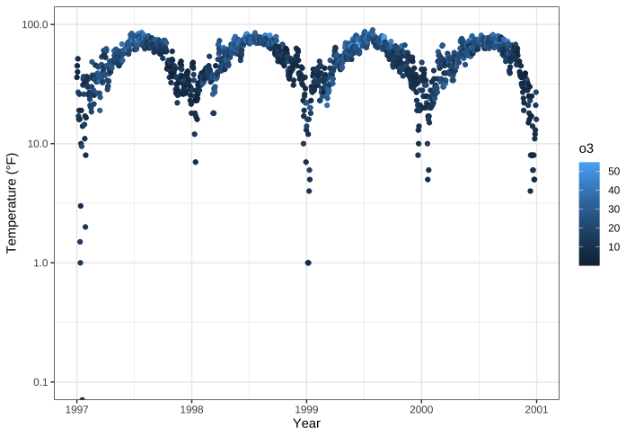
季节等分类变量的默认图例是guide_legend() ,这在之前的几个示例中都有所体现。如果将连续变量映射为审美变量,{ggplot2} 默认不使用 guide_legend(),而是使用guide_colorbar() (或guide_colourbar()
不过,通过使用guide_legend() ,您可以强制图例显示给定断点数的离散颜色,就像分类变量一样:1
2
3
4
5ggplot(chic,
aes(x = date, y = temp, color = temp)) +
geom_point() +
labs(x = "Year", y = "Temperature (°F)", color = "Temperature (°F)") +
guides(color = guide_legend())
您还可以使用分档刻度:1
2
3
4
5ggplot(chic,
aes(x = date, y = temp, color = temp)) +
geom_point() +
labs(x = "Year", y = "Temperature (°F)", color = "Temperature (°F)") +
guides(color = guide_bins())

……或作为离散色条的分选标尺:1
2
3
4
5ggplot(chic,
aes(x = date, y = temp, color = temp)) +
geom_point() +
labs(x = "Year", y = "Temperature (°F)", color = "Temperature (°F)") +
guides(color = guide_colorsteps())

背景和网格线
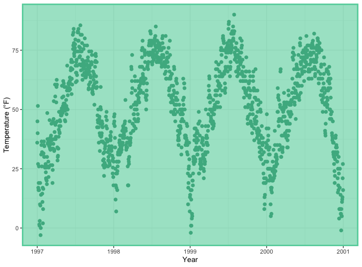
有一些方法可以通过一个函数改变整个绘图的外观(见下文 “主题 “部分),但如果您只想改变一些元素的颜色,也可以这样做。
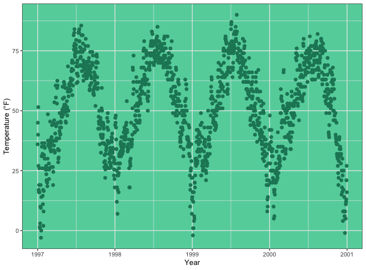
更改面板背景颜色
要更改面板区域(即绘制数据的区域)的背景色(填充色),需要调整主题元素panel.background :1
2
3
4
5
6ggplot(chic, aes(x = date, y = temp)) +
geom_point(color = "#1D8565", size = 2) +
labs(x = "Year", y = "Temperature (°F)") +
theme(panel.background = element_rect(
fill = "#64D2AA", color = "#64D2AA", linewidth = 2)
)
请注意,即使我们指定了真正的颜色—面板背景的轮廓—也没有改变。这是因为在panel.background 的顶部还有一个层,即panel.border 。不过,请确保在这里使用透明填充,否则您的数据就会隐藏在这一层后面。在下面的示例中,我使用半透明的十六进制颜色作为element_rect 中的填充参数来说明这一点:1
2
3
4
5
6ggplot(chic, aes(x = date, y = temp)) +
geom_point(color = "#1D8565", size = 2) +
labs(x = "Year", y = "Temperature (°F)") +
theme(panel.border = element_rect(
fill = "#64D2AA99", color = "#64D2AA", linewidth = 2)
)
改变网格线
网格线有两种类型:表示刻度线的主要网格线和主要刻度线之间的次要网格线。您可以通过覆盖panel.grid 的默认值或分别覆盖panel.grid.major 和panel.grid.minor 每组网格线的默认值来更改所有网格线。1
2
3
4
5ggplot(chic, aes(x = date, y = temp)) +
geom_point(color = "firebrick") +
labs(x = "Year", y = "Temperature (°F)") +
theme(panel.grid.major = element_line(color = "gray10", linewidth = .5),
panel.grid.minor = element_line(color = "gray70", linewidth = .25))

您甚至可以指定所有四个不同级别的设置:1
2
3
4
5
6
7
8
9ggplot(chic, aes(x = date, y = temp)) +
geom_point(color = "firebrick") +
labs(x = "Year", y = "Temperature (°F)") +
theme(panel.grid.major = element_line(linewidth = .5, linetype = "dashed"),
panel.grid.minor = element_line(linewidth = .25, linetype = "dotted"),
panel.grid.major.x = element_line(color = "red1"),
panel.grid.major.y = element_line(color = "blue1"),
panel.grid.minor.x = element_line(color = "red4"),
panel.grid.minor.y = element_line(color = "blue4"))

当然,如果你愿意,也可以移除部分或全部网格线:1
2
3
4ggplot(chic, aes(x = date, y = temp)) +
geom_point(color = "firebrick") +
labs(x = "Year", y = "Temperature (°F)") +
theme(panel.grid.minor = element_blank())
1 | ggplot(chic, aes(x = date, y = temp)) + |

更改网格线间距
此外,您还可以定义主网格线和次网格线之间的分隔:1
2
3
4
5ggplot(chic, aes(x = date, y = temp)) +
geom_point(color = "firebrick") +
labs(x = "Year", y = "Temperature (°F)") +
scale_y_continuous(breaks = seq(0, 100, 10),
minor_breaks = seq(0, 100, 2.5))

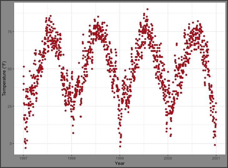
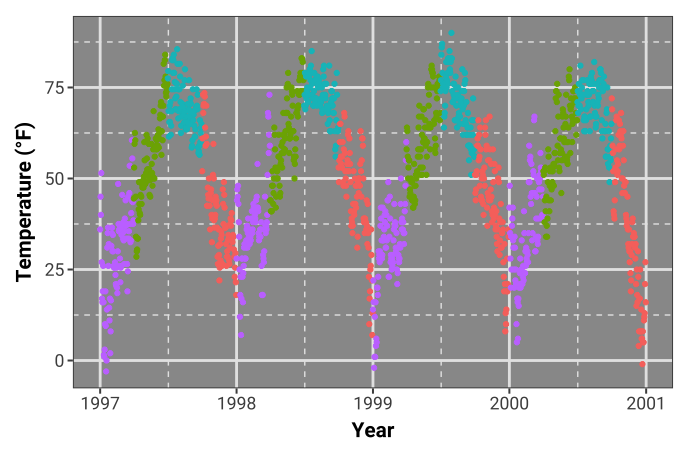
更改绘图背景颜色
同样,要更改绘图区域的背景颜色(填充),需要修改主题元素plot.background :1
2
3
4
5ggplot(chic, aes(x = date, y = temp)) +
geom_point(color = "firebrick") +
labs(x = "Year", y = "Temperature (°F)") +
theme(plot.background = element_rect(fill = "gray60",
color = "gray30", linewidth = 2))
您可以在panel.background 和plot.background 中设置相同的颜色,或者将面板的背景填充设置为 “”transparent” “或 NA,从而获得独特的背景颜色:1
2
3
4
5
6ggplot(chic, aes(x = date, y = temp)) +
geom_point(color = "firebrick") +
labs(x = "Year", y = "Temperature (°F)") +
theme(panel.background = element_rect(fill = NA),
plot.background = element_rect(fill = "gray60",
color = "gray30", linewidth = 2))
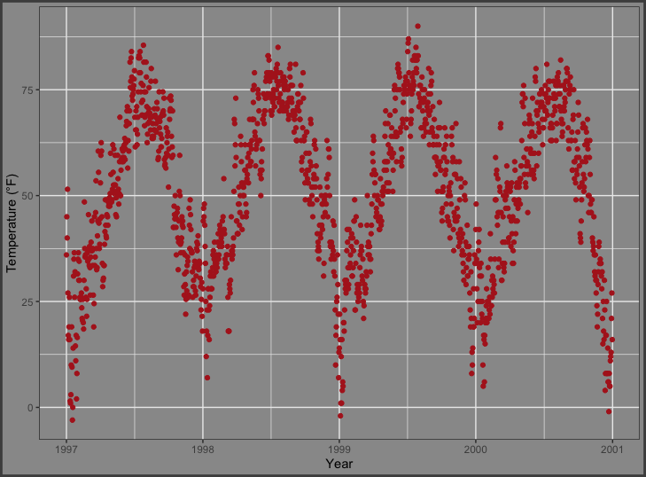
边距
有时,给绘图边距增加一点空间也很有用。与前面的例子类似,我们可以使用 theme() 函数的一个参数。本例中的参数是plot.margin 。在上一个示例中,我们已经通过plot.background 更改背景颜色来说明默认边距。
现在,让我们在左侧和右侧添加额外的空间。参数plot.margin 可以处理各种不同的单位(厘米cm、英寸inches等),但需要使用软件包grid 中的函数unit 来指定单位。您可以为所有边提供相同的值(最简单的方法是使用rep(x,4)),也可以为每个边提供特定的距离。在这里,我在顶部和底部使用了1厘米的边距,在右侧使用了3厘米的边距,在左侧使用了8厘米的边距。1
2
3
4
5ggplot(chic, aes(x = date, y = temp)) +
geom_point(color = "firebrick") +
labs(x = "Year", y = "Temperature (°F)") +
theme(plot.background = element_rect(fill = "gray60"),
plot.margin = margin(t = 1, r = 3, b = 1, l = 8, unit = "cm"))

🧙♀️你也可以使用unit()代替margin()。
1 | ggplot(chic, aes(x = date, y = temp)) + |
he
多面板图
{ggplot2}软件包有两个创建多面板绘图的好函数,称为切面。它们相互关联,但又略有不同:facet_wrap 主要是根据单一变量创建图形带,而facet_grid 则是跨越两个变量的网格。
基于两个变量创建多面版图
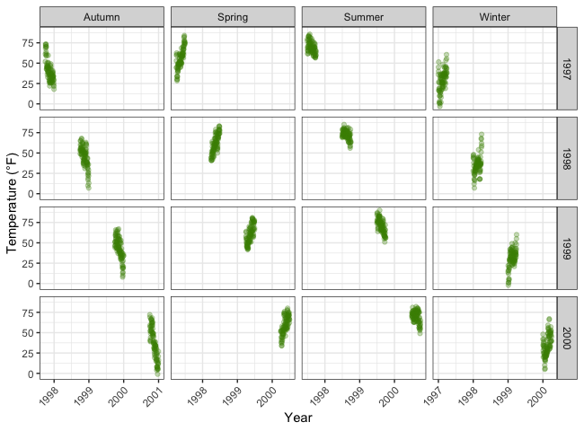
如果有两个变量,则由faceet_grid 来完成。在这里,变量的顺序决定了行数和列数:1
2
3
4
5ggplot(chic, aes(x = date, y = temp)) +
geom_point(color = "orangered", alpha = .3) +
theme(axis.text.x = element_text(angle = 45, vjust = 1, hjust = 1)) +
labs(x = "Year", y = "Temperature (°F)") +
facet_grid(year ~ season)
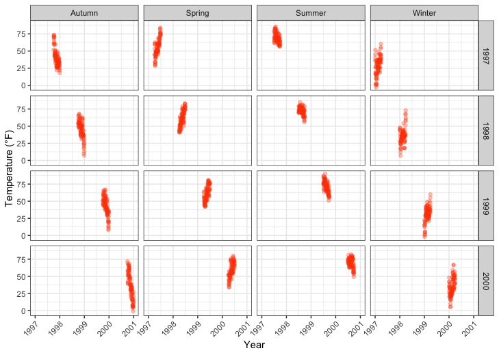
你能将facet_grid(year~season) 改为hefacet_grid(season~year) ,从而将行排列改为列。
基于一个变量创建多面板图
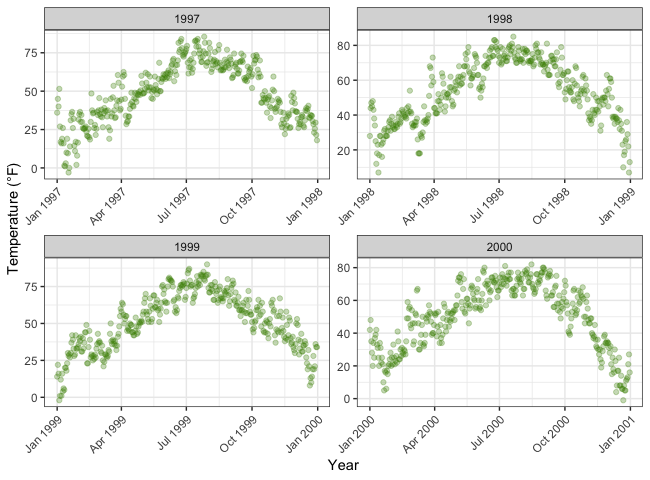
facet_wrap 可以创建单个变量的多面板图,在前面加上波浪号:facet_wrap(~variable) 。这些子图的外观由参数ncol 和nrow 控制:1 | g <- |
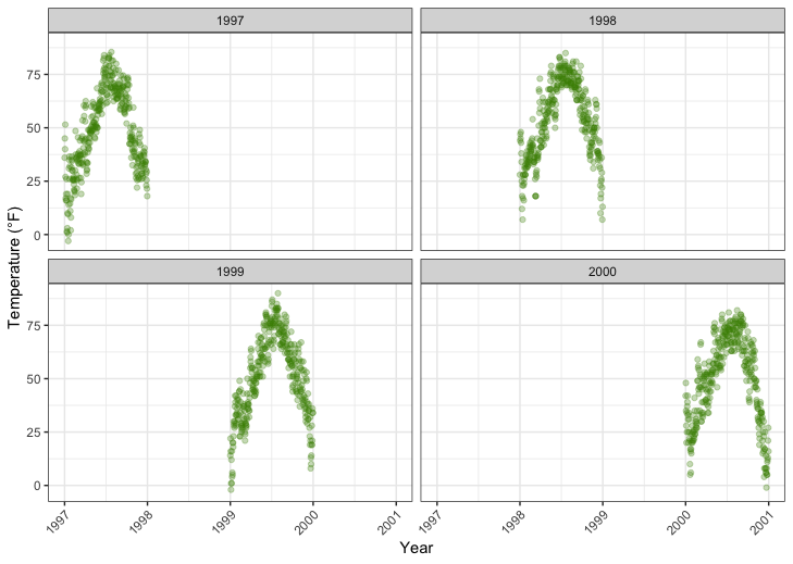
因此,您可以按照自己的喜好排列图块,而不是以一行矩阵的形式…1
g + facet_wrap(~ year, nrow = 1)
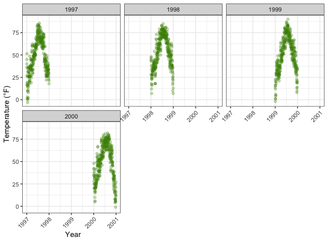
……甚至是不对称的网格块:1
g + facet_wrap(~ year, ncol = 3) + theme(axis.title.x = element_text(hjust = .15))
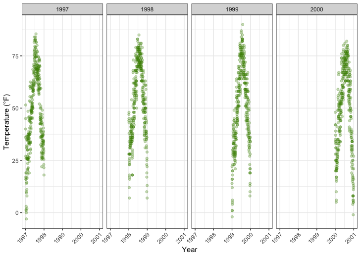
允许坐标轴自由定义比例
{ggplot2}中的多面板图默认在每个面板中使用等效比例。但有时您希望让面板自身的数据来决定比例。这通常不是一个好主意,因为它可能会给用户留下错误的数据印象。但有时这确实是有用的,为此您可以设置 scales=free :1
g + facet_wrap(~ year, nrow = 2, scales = "free")
请注意,X 轴和 Y 轴的范围不同!
当两个变量时使用facet_wrap
函数facet_wrap 也可以使用两个变量:1
g + facet_wrap(year ~ season, nrow = 4, scales = "free_x")
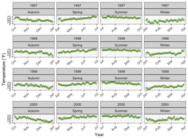
使用facet_wrap 时,你仍然可以控制网格设计:你可以重新排列每行和每列的绘图数量,也可以让所有坐标轴自由移动。相比之下,facet_grid 也会接受一个自由参数,但只能让它在每列或每行自由移动:
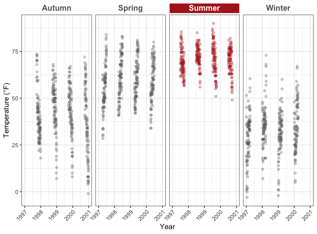
修改带状文本的风格
通过使用主题,您可以修改条状文本(即每个面的标题)和条状文本框的外观:1
2
3
4g + facet_wrap(~ year, nrow = 1, scales = "free_x") +
theme(strip.text = element_text(face = "bold", color = "chartreuse4",
hjust = 0, size = 20),
strip.background = element_rect(fill = "chartreuse3", linetype = "dotted"))

以下两个函数改编自{ggtext}软件包的作者Claus Wilke,可以与{ggtext}提供的element_textbox() 结合使用,突出显示特定标签。1
2
3
4
5
6
7
8
9
10
11
12
13
14
15
16
17
18
19
20
21
22library(ggtext)
library(purrr) ## for %||%
element_textbox_highlight <- function(..., hi.labels = NULL, hi.fill = NULL,
hi.col = NULL, hi.box.col = NULL, hi.family = NULL) {
structure(
c(element_textbox(...),
list(hi.labels = hi.labels, hi.fill = hi.fill, hi.col = hi.col, hi.box.col = hi.box.col, hi.family = hi.family)
),
class = c("element_textbox_highlight", "element_textbox", "element_text", "element")
)
}
element_grob.element_textbox_highlight <- function(element, label = "", ...) {
if (label %in% element$hi.labels) {
element$fill <- element$hi.fill %||% element$fill
element$colour <- element$hi.col %||% element$colour
element$box.colour <- element$hi.box.col %||% element$box.colour
element$family <- element$hi.family %||% element$family
}
NextMethod()
}
现在,您可以使用它来指定所有文本条:1
2
3
4
5
6
7
8
9
10
11
12g + facet_wrap(year ~ season, nrow = 4, scales = "free_x") +
theme(
strip.background = element_blank(),
strip.text = element_textbox_highlight(
family = "Arial", size = 12, face = "bold",
fill = "white", box.color = "chartreuse4", color = "chartreuse4",
halign = .5, linetype = 1, r = unit(5, "pt"), width = unit(1, "npc"),
padding = margin(5, 0, 3, 0), margin = margin(0, 1, 3, 1),
hi.labels = c("1997", "1998", "1999", "2000"),
hi.fill = "chartreuse4", hi.box.col = "black", hi.col = "white"
)
)

1 | ggplot(chic, aes(x = date, y = temp)) + |
一个面板两个图形
有几种方法可以组合图形。我认为最简单的方法是托马斯-林-佩德森(Thomas Lin Pedersen)的{patchwork}软件包:1
2
3
4
5
6
7
8
9
10
11
12
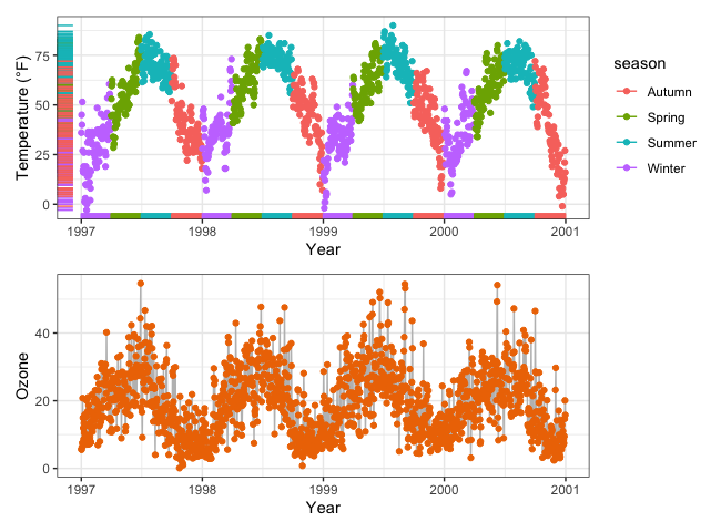
13p1 <- ggplot(chic, aes(x = date, y = temp,
color = season)) +
geom_point() +
geom_rug() +
labs(x = "Year", y = "Temperature (°F)")
p2 <- ggplot(chic, aes(x = date, y = o3)) +
geom_line(color = "gray") +
geom_point(color = "darkorange2") +
labs(x = "Year", y = "Ozone")
library(patchwork)
p1 + p2
我们可以通过 “分割 “两个图来改变顺序(注意,即使一个有图例,一个没有图例,也要对齐!):1
p1 / p2
还可以嵌套绘图!1
(g + p2) / p1
(请注意,尽管只有一幅图包含图例,但这些图还是保持了一致)。
另外,Claus Wilke 的{cowplot}软件包提供了合并多个绘图的功能(还有很多其他实用工具):1
2library(cowplot)
plot_grid(plot_grid(g, p1), p2, ncol = 1)

…{gridExtra}软件包也是如此:1
2
3library(gridExtra)
grid.arrange(g, p1, p2,
layout_matrix = rbind(c(1, 2), c(3, 3)))
定义布局的想法同样适用于{patchwork},它可以创建复杂的组合:1
2
3
4
5
6
7
8
9layout <- "
AABBBB#
AACCDDE
##CCDD#
##CC###
"
p2 + p1 + p1 + g + p2 +
plot_layout(design = layout)
颜色
在{ggplot2}中,对于简单的应用来说,使用颜色非常简单。如果想了解更高级的处理方法,你可能应该去看看Hadley的书,里面有很好的介绍。其他有用的资料包括R Cookbook》和Yan Holtz所著《R Graph Gallery》中的 “color “部分。
{ggplot2}中的颜色有两个主要区别。color 和fill 这两个参数都可以
- 指定为单一颜色
- 指定为变量
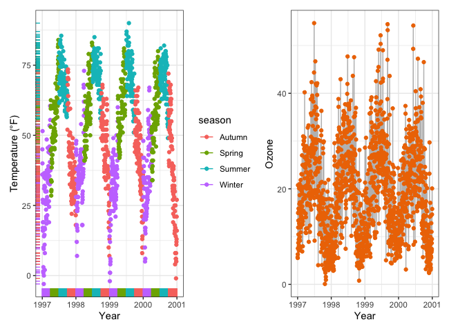
正如你在本教程开头已经看到的,在aes 内部的变量是由变量编码的,而在美学范围外的变量则是与变量无关的属性。这幅显示每年和每季记录数的完全无意义的图就说明了这一事实:1
2
3ggplot(chic, aes(year)) +
geom_bar(aes(fill = season), color = "grey", linewidth = 2) +
labs(x = "Year", y = "Observations", fill = "Season:")
指定单一颜色
静态单一颜色的使用很简单。我们可以为一个图形指定单一颜色:1
2
3ggplot(chic, aes(x = date, y = temp)) +
geom_point(color = "steelblue", size = 2) +
labs(x = "Year", y = "Temperature (°F)")
… 如果同时提供color (轮廓颜色)和fill (填充颜色):1
2
3
4ggplot(chic, aes(x = date, y = temp)) +
geom_point(shape = 21, size = 2, stroke = 1,
color = "#3cc08f", fill = "#c08f3c") +
labs(x = "Year", y = "Temperature (°F)")
哥伦比亚大学的 Tian Zheng 制作了一份有用的R颜色PDF。当然,您也可以指定十六进制颜色代码(如上例中的字符串)以及RGB或RGBA值(通过rgb() 函数:rgb(red, green, blue, alpha))。
为变量指定颜色
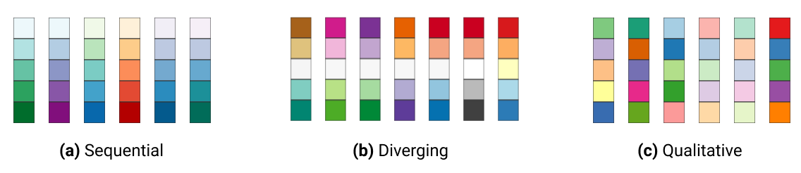
在 {ggplot2} 中,通过scale_color_* 和scale_fill_* 函数可以修改分配给变量的颜色。要在数据中使用颜色,最重要的是要知道所处理的是分类变量还是连续变量。调色板的选择应取决于变量的类型,连续变量应使用连续调色板或发散调色板,分类变量应使用定性调色板:
定性变量
定性变量或分类变量代表可划分为不同组(类别)的数据类型。变量还可进一步分为名义变量、顺序变量和二元变量(二分变量)。定性/分类变量的例子有:

默认的分类调色板如下所示:1
2
3(ga <- ggplot(chic, aes(x = date, y = temp, color = season)) +
geom_point() +
labs(x = "Year", y = "Temperature (°F)", color = NULL))
手动选择定性颜色
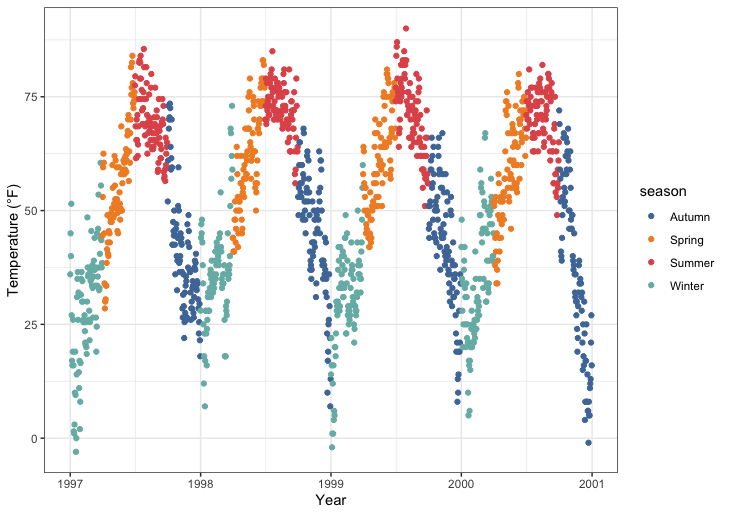
您可以通过scale_*_manual() 函数(* 可以是color 、colour 或fill )自行选择一组颜色并将其分配给分类变量。指定颜色的数量必须与类别的数量相匹配:
1 | ga + scale_color_manual(values = c("dodgerblue4", |
使用内置定性调色板
ColorBrewer调色板是一种用于选择地图配色方案的流行在线工具。我们设计了不同的颜色集,以产生外观相似、极具吸引力的颜色方案,颜色范围从三种到十二种不等。这些调色板可作为 {ggplot2} 软件包的内置函数,通过调用scale_*_brewer() 来应用:1
ga + scale_color_brewer(palette = "Set1")

💡 您可以通过以下方式查看所有可用计划
RColorBrewer::display.brewer.all()
使用扩展软件包中的定性调色板
有许多扩展软件包可以提供额外的调色板。它们的用途因软件包的设计方式而异。关于 R 中可用调色板的广泛概述,请查看Emil Hvitfeldt提供的集合。我们还可以使用他的{paletteer}软件包,这是一个使用统一语法的 R 色板综合集合。
例如
例如,{ggthemes}软件包可以让 R 用户访问 Tableau 颜色。Tableau 是一款著名的可视化软件,拥有众所周知的调色板。1
2library(ggthemes)
ga + scale_color_tableau()
{ggsci}软件包提供科学杂志和科幻主题调色板。想让情节的色彩看起来像发表在《科学》或《自然》杂志上的文章吗?给你!1
2
3
4
5
6library(ggsci)
g1 <- ga + scale_color_aaas()
g2 <- ga + scale_color_npg()
library(patchwork)
(g1 + g2) * theme(legend.position = "top")
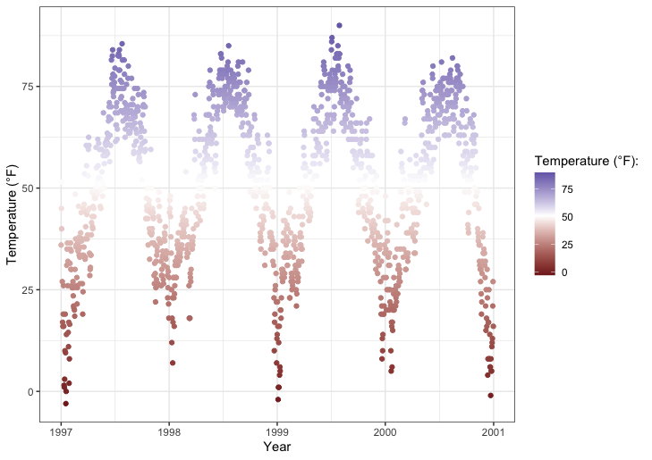
定量变量
定量变量代表一个可测量的量,因此是数值型的。定量数据还可进一步分为连续数据(可使用浮点数)和离散数据(仅限整数):
在我们的示例中,我们将把要着色的变量改为臭氧,这是一个与温度密切相关的连续变量(温度越高,臭氧越高)。函数scale_*_gradient() 是顺序梯度,而scale_*_gradient2() 是发散梯度。
下面是连续变量的默认 {ggplot2} 序列颜色方案:1
2
3
4
5gb <- ggplot(chic, aes(x = date, y = temp, color = temp)) +
geom_point() +
labs(x = "Year", y = "Temperature (°F)", color = "Temperature (°F):")
gb + scale_color_continuous()

该代码可生成相同的曲线图:1
gb + scale_color_gradient()
下面是不同的默认配色方案:1
2
3mid <- mean(chic$temp) ## midpoint
gb + scale_color_gradient2(midpoint = mid)
手动设置序列颜色方案
您可以通过scale_*_gradient() 手动为连续变量设置逐渐变化的调色板:1
2gb + scale_color_gradient(low = "darkkhaki",
high = "darkgreen")
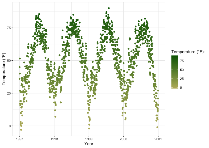
温度数据是正态分布的,因此采用发散颜色方案(而不是顺序颜色)如何……对于发散颜色,您可以使用scale_*_gradient2() 函数:1
2gb + scale_color_gradient2(midpoint = mid, low = "#dd8a0b",
mid = "grey92", high = "#32a676")
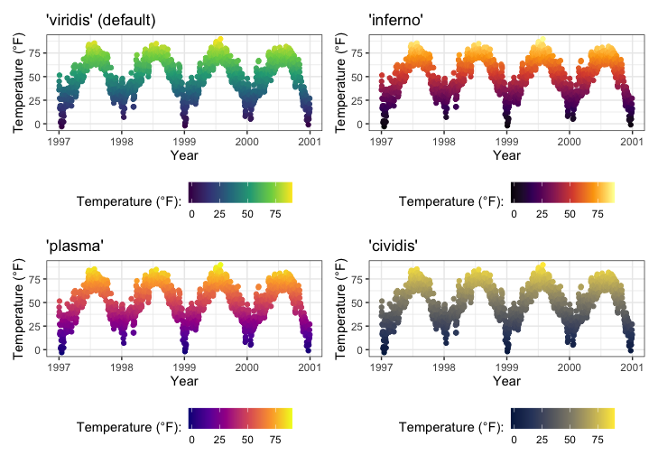
美丽的 Viridis 调色板
viridis调色板不仅能让您的绘图看起来漂亮、易于感知,还能让色盲症患者更容易阅读,并能很好地进行灰度打印。您可以使用 {dichromat} 软件包测试各种色盲情况下的绘图效果。
现在,它们也与 {ggplot2} 一起提供!下面的多面板图展示了四种 viridis 调色板中的三种:1
2
3
4
5
6
7p1 <- gb + scale_color_viridis_c() + ggtitle("'viridis' (default)")
p2 <- gb + scale_color_viridis_c(option = "inferno") + ggtitle("'inferno'")
p3 <- gb + scale_color_viridis_c(option = "plasma") + ggtitle("'plasma'")
p4 <- gb + scale_color_viridis_c(option = "cividis") + ggtitle("'cividis'")
library(patchwork)
(p1 + p2 + p3 + p4) * theme(legend.position = "bottom")
离散变量也可以使用 viridis 调色板:1
ga + scale_color_viridis_d(guide = "none")

使用扩展软件包中的定量调色板
许多扩展软件包不仅提供了额外的分类调色板,还提供了顺序、发散甚至循环调色板。在此,我再次向您推荐Emil Hvitfeldt提供的大量资料,供您了解概况。
例如
{rcartocolors}包将漂亮的CARTOcolors移植到 {ggplot2},并包含了我最常用的几个调色板:1
2
3
4
5library(rcartocolor)
g1 <- gb + scale_color_carto_c(palette = "BurgYl")
g2 <- gb + scale_color_carto_c(palette = "Earth")
(g1 + g2) * theme(legend.position = "bottom")
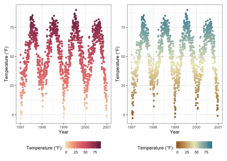
通过{scico}软件包,可以访问Fabio Crameri开发的调色板。这些调色板不仅美观大方,而且往往与众不同,是一种很好的选择,因为它们在感知上是统一有序的。此外,它们还适用于色觉缺陷者和灰度用户:1
2
3
4
5library(scico)
g1 <- gb + scale_color_scico(palette = "berlin")
g2 <- gb + scale_color_scico(palette = "hawaii", direction = -1)
(g1 + g2) * theme(legend.position = "bottom")
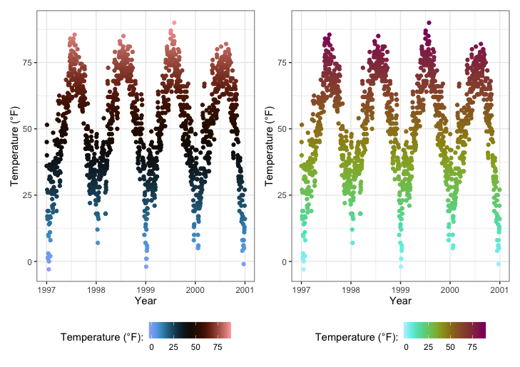
事后修改调色板
自 ggplot2 3.0.0 发布以来,人们可以在将图层映射到数据后修改图层的美观度。或者按照 {ggplot2} 的说法 “使用after_scale() 标记数据缩放后的映射评估”。
那么,为什么不首先使用修改后的颜色呢?由于{ggplot2}只能处理一种color 和一种fill 比例,因此这是一个有趣的功能。请看下面的示例,我们使用了{prismatic}软件包中的clr_negate() :1
2
3
4
5
6
7
8
9library(prismatic)
ggplot(chic, aes(date, temp, color = temp)) +
geom_point(size = 5) +
geom_point(aes(color = temp,
color = after_scale(clr_negate(color))),
size = 2) +
scale_color_scico(palette = "hawaii", guide = "none") +
labs(x = "Year", y = "Temperature (°F)")
使用{prismatic}软件包中的clr_negate() 、clr_lighten() 、clr_darken() 和clr_desaturate() 等函数,事后更改配色方案尤其有趣。你甚至可以将这些函数组合使用。在这里,我们绘制一个同时拥有color 和fill 两个参数的方框图:1
2
3
4
5
6
7
8
9
10library(prismatic)
ggplot(chic, aes(date, temp)) +
geom_boxplot(
aes(color = season,
fill = after_scale(clr_desaturate(clr_lighten(color, .6), .6))),
linewidth = 1
) +
scale_color_brewer(palette = "Dark2", guide = "none") +
labs(x = "Year", y = "Temperature (°F)")
请注意,您需要在相应的geom_*() 或stat_*() 的aes() 中指定color 和/或fill ,才能使after_scale() 正常工作。
💡 现在看来这有点复杂—可以简单地同时使用color 和fill 比例。是的,这没错,但想想在什么情况下需要多个color 和/或fill 刻度。在这种情况下,用color 调色板的稍暗版本来占用fill 刻度是毫无意义的。
主题
更改总体绘图风格
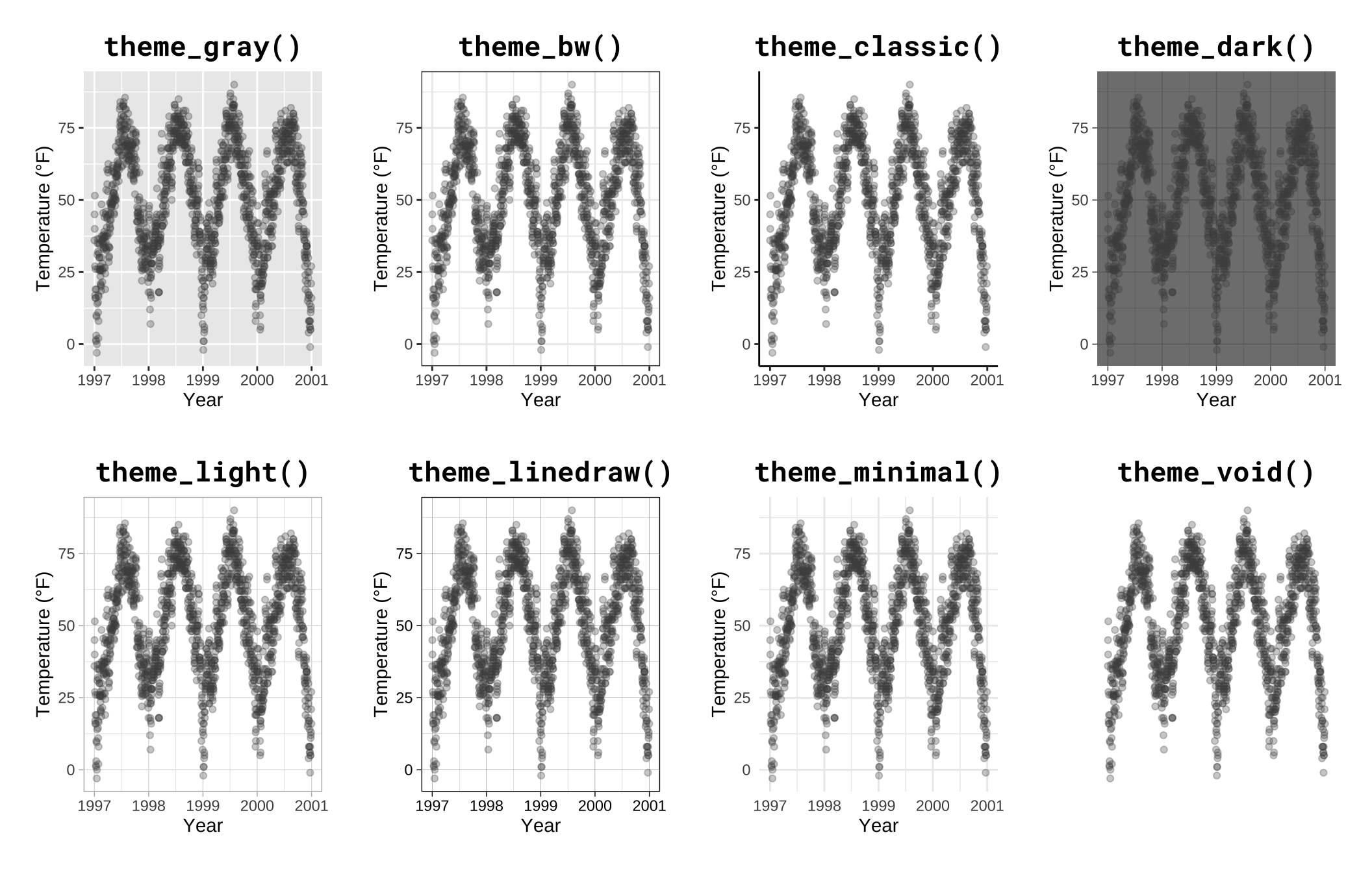
您可以使用主题来改变绘图的整体外观。{ggplot2}内置了八个主题:
有几个软件包提供了额外的主题,有些甚至带有不同的默认调色板。例如,杰弗里-阿诺德(Jeffrey Arnold)创建了{ggthemes}库,其中包含多个模仿流行设计的自定义主题。有关列表,请访问{ggthemes}软件包网站。无需编写任何代码,你就可以改编几种风格,其中一些以风格和美学著称。
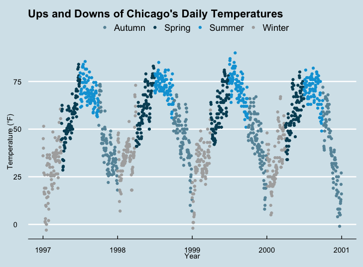
下面是一个使用theme_economist() 和scale_color_economist() 复制《经济学人》杂志绘图风格的示例:1
2
3
4
5
6
7
8library(ggthemes)
ggplot(chic, aes(x = date, y = temp, color = season)) +
geom_point() +
labs(x = "Year", y = "Temperature (°F)") +
ggtitle("Ups and Downs of Chicago's Daily Temperatures") +
theme_economist() +
scale_color_economist(name = NULL)
另一个例子是 Tufte 的绘图风格,这是一种基于爱德华-塔夫特(Edward Tufte)的《量化信息的可视化显示》一书的极简水墨主题。正是这本书将米纳尔描绘拿破仑进军俄国的图表推广为有史以来最好的统计图之一。塔夫特的图表因其纯粹的风格而闻名于世。但你自己看看吧:1
2
3
4
5
6
7
8library(dplyr)
chic_2000 <- filter(chic, year == 2000)
ggplot(chic_2000, aes(x = temp, y = o3)) +
geom_point() +
labs(x = "Temperature (°F)", y = "Ozone") +
ggtitle("Temperature and Ozone Levels During the Year 2000 in Chicago") +
theme_tufte()
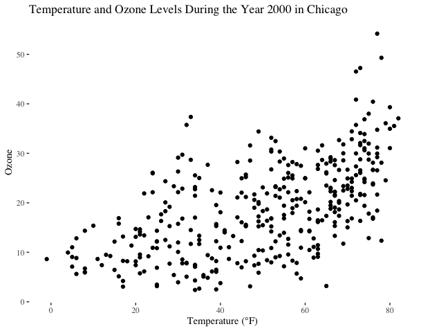
我在这里减少了数据点的数量,只是为了适应Tufte的极简主义风格。如果你喜欢这种绘图方式,可以看看这篇博客文章,在 R 中绘制几幅 Tufte 图。
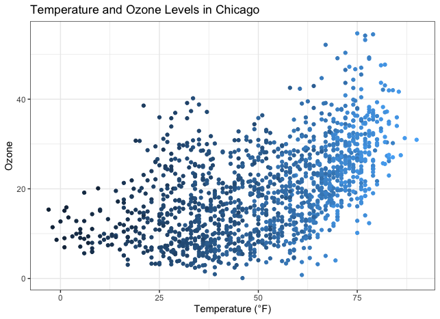
Bob Rudis 制作的{hrbrthemes}软件包是另一款具有现代主题和非默认字体预设的软件包,其中包含多个浅色和深色主题:1
2
3
4
5
6library(hrbrthemes)
ggplot(chic, aes(x = temp, y = o3)) +
geom_point(aes(color = dewpoint), show.legend = FALSE) +
labs(x = "Temperature (°F)", y = "Ozone") +
ggtitle("Temperature and Ozone Levels in Chicago")
更改所有文本元素的字体
要一次性更改所有文本元素的设置,简直易如反掌。所有主题都有一个名为base_family 的参数:1
2
3
4
5
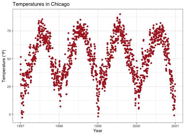
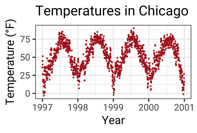
6g <- ggplot(chic, aes(x = date, y = temp)) +
geom_point(color = "firebrick") +
labs(x = "Year", y = "Temperature (°F)",
title = "Temperatures in Chicago")
g + theme_bw(base_family = "sans")
更改所有文本元素的大小
此外,theme_*() 函数还提供了其他几个base_* 参数。如果仔细观察一下默认主题(参见下文 “创建并使用自定义主题 “一章),你会发现所有元素的大小都是相对于base_size 的(rel()) 。因此,如果您想提高绘图的可读性,只需更改基尺寸即可:1
g + theme_bw(base_size = 30, base_family = "Roboto Condensed")
更改所有线条和矩形元素的大小
同样,您也可以更改所有line 和rect 类型元素的大小:1
g + theme_bw(base_line_size = 1, base_rect_size = 1)
创建自己的主题
如果要更改整个会话的主题,可以使用theme_set ,如theme_set(theme_bw()) 。默认主题为theme_gray 。如果你想创建自己的自定义主题,可以直接从灰色主题中提取代码并修改。请注意,rel() 函数会改变相对于base_size 的尺寸。1
theme_gray
1
2
3
4
5
6
7
8
9
10
11
12
13
14
15
16
17
18
19
20
21
22
23
24
25
26
27
28
29
30
31
32
33
34
35
36
37
38
39
40
41
42
43
44
45
46
47
48
49
50
51
52
53
54
55
56
57
58
59
60## function (base_size = 11, base_family = "", base_line_size = base_size/22,
## base_rect_size = base_size/22)
## {
## half_line <- base_size/2
## t <- theme(line = element_line(colour = "black", linewidth = base_line_size,
## linetype = 1, lineend = "butt"), rect = element_rect(fill = "white",
## colour = "black", linewidth = base_rect_size, linetype = 1),
## text = element_text(family = base_family, face = "plain",
## colour = "black", size = base_size, lineheight = 0.9,
## hjust = 0.5, vjust = 0.5, angle = 0, margin = margin(),
## debug = FALSE), axis.line = element_blank(), axis.line.x = NULL,
## axis.line.y = NULL, axis.text = element_text(size = rel(0.8),
## colour = "grey30"), axis.text.x = element_text(margin = margin(t = 0.8 *
## half_line/2), vjust = 1), axis.text.x.top = element_text(margin = margin(b = 0.8 *
## half_line/2), vjust = 0), axis.text.y = element_text(margin = margin(r = 0.8 *
## half_line/2), hjust = 1), axis.text.y.right = element_text(margin = margin(l = 0.8 *
## half_line/2), hjust = 0), axis.ticks = element_line(colour = "grey20"),
## axis.ticks.length = unit(half_line/2, "pt"), axis.ticks.length.x = NULL,
## axis.ticks.length.x.top = NULL, axis.ticks.length.x.bottom = NULL,
## axis.ticks.length.y = NULL, axis.ticks.length.y.left = NULL,
## axis.ticks.length.y.right = NULL, axis.title.x = element_text(margin = margin(t = half_line/2),
## vjust = 1), axis.title.x.top = element_text(margin = margin(b = half_line/2),
## vjust = 0), axis.title.y = element_text(angle = 90,
## margin = margin(r = half_line/2), vjust = 1), axis.title.y.right = element_text(angle = -90,
## margin = margin(l = half_line/2), vjust = 0), legend.background = element_rect(colour = NA),
## legend.spacing = unit(2 * half_line, "pt"), legend.spacing.x = NULL,
## legend.spacing.y = NULL, legend.margin = margin(half_line,
## half_line, half_line, half_line), legend.key = element_rect(fill = "grey95",
## colour = NA), legend.key.size = unit(1.2, "lines"),
## legend.key.height = NULL, legend.key.width = NULL, legend.text = element_text(size = rel(0.8)),
## legend.text.align = NULL, legend.title = element_text(hjust = 0),
## legend.title.align = NULL, legend.position = "right",
## legend.direction = NULL, legend.justification = "center",
## legend.box = NULL, legend.box.margin = margin(0, 0, 0,
## 0, "cm"), legend.box.background = element_blank(),
## legend.box.spacing = unit(2 * half_line, "pt"), panel.background = element_rect(fill = "grey92",
## colour = NA), panel.border = element_blank(), panel.grid = element_line(colour = "white"),
## panel.grid.minor = element_line(linewidth = rel(0.5)),
## panel.spacing = unit(half_line, "pt"), panel.spacing.x = NULL,
## panel.spacing.y = NULL, panel.ontop = FALSE, strip.background = element_rect(fill = "grey85",
## colour = NA), strip.clip = "inherit", strip.text = element_text(colour = "grey10",
## size = rel(0.8), margin = margin(0.8 * half_line,
## 0.8 * half_line, 0.8 * half_line, 0.8 * half_line)),
## strip.text.x = NULL, strip.text.y = element_text(angle = -90),
## strip.text.y.left = element_text(angle = 90), strip.placement = "inside",
## strip.placement.x = NULL, strip.placement.y = NULL, strip.switch.pad.grid = unit(half_line/2,
## "pt"), strip.switch.pad.wrap = unit(half_line/2,
## "pt"), plot.background = element_rect(colour = "white"),
## plot.title = element_text(size = rel(1.2), hjust = 0,
## vjust = 1, margin = margin(b = half_line)), plot.title.position = "panel",
## plot.subtitle = element_text(hjust = 0, vjust = 1, margin = margin(b = half_line)),
## plot.caption = element_text(size = rel(0.8), hjust = 1,
## vjust = 1, margin = margin(t = half_line)), plot.caption.position = "panel",
## plot.tag = element_text(size = rel(1.2), hjust = 0.5,
## vjust = 0.5), plot.tag.position = "topleft", plot.margin = margin(half_line,
## half_line, half_line, half_line), complete = TRUE)
## ggplot_global$theme_all_null %+replace% t
## }
## <bytecode: 0x7fb89d268170>
## <environment: namespace:ggplot2>
现在,让我们修改默认主题功能,看看结果如何:
1 | theme_custom <- function (base_size = 12, base_family = "Roboto Condensed") { |
💡 您只能覆盖所有要更改的元素的默认值。我在这里列出了所有元素,这样你就可以看到你可以更改所有元素!
面板、网格线以及坐标轴刻度、文本和标题都采用了新的美学设计:1
2
3
4theme_set(theme_custom())
ggplot(chic, aes(x = date, y = temp, color = season)) +
geom_point() + labs(x = "Year", y = "Temperature (°F)") + guides(color = "none")
强烈推荐使用这种方式更改地块设计!只需更改一次,您就可以快速更改绘图中的任何元素。您可以在几秒钟内将所有结果绘制成风格一致的图表,并根据其他需要进行调整(例如,在演示文稿中使用更大的字体或满足期刊要求)。
更新当前主题
您还可以使用theme_update() 设置快速更改:1
2
3
4theme_custom <- theme_update(panel.background = element_rect(fill = "gray60"))
ggplot(chic, aes(x = date, y = temp, color = season)) +
geom_point() + labs(x = "Year", y = "Temperature (°F)") + guides(color = "none")
在进一步的练习中,我们将使用自己的主题,使用白色填充,不使用小网格线:1
2
3
4
5theme_custom <- theme_update(
panel.background = element_rect(fill = "white"),
panel.grid.major = element_line(linewidth = .5),
panel.grid.minor = element_blank()
)
线条
添加水平或垂直线
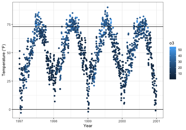
您可能希望突出显示给定的范围或阈值,这可以使用geom_hline() (用于 “水平线”)或 geom_vline() (用于 “垂直线”)在定义的坐标上绘制一条线:1
2
3
4ggplot(chic, aes(x = date, y = temp, color = o3)) +
geom_point() +
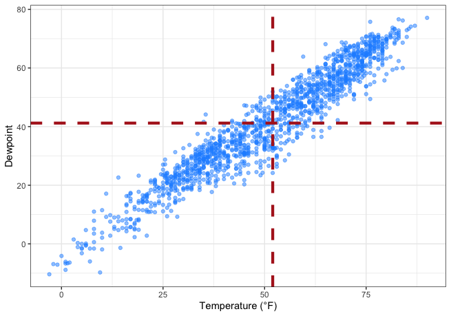
geom_hline(yintercept = c(0, 73)) +
labs(x = "Year", y = "Temperature (°F)")
1 | g <- ggplot(chic, aes(x = temp, y = dewpoint)) + |
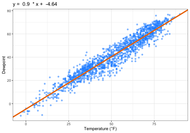
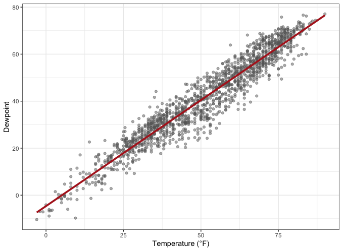
如果要添加斜率不是 0 或 1 的直线,则需要使用geom_abline() 。例如,如果要使用截距和斜率参数添加回归线,就需要使用geom_abline() :1
2
3
4
5
6
7
8
9reg <- lm(dewpoint ~ temp, data = chic)
g +
geom_abline(intercept = coefficients(reg)[1],
slope = coefficients(reg)[2],
color = "darkorange2",
linewidth = 1.5) +
labs(title = paste("y = ", round(coefficients(reg)[2], 2),
" * x + ", round(coefficients(reg)[1], 2)))
稍后,我们将学习如何使用stat_smooth(method=lm) 命令添加线性拟合。不过,可能还有其他原因需要添加一条具有给定斜率的直线,我们可以这样做🧜🏻♂️。
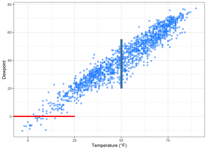
在图中添加线
以前的方法总是覆盖绘图面板的整个范围,但有时人们只想突出显示某个区域或使用线条进行注释。在这种情况下,geom_linerange() 就能帮上忙:1
2
3
4
5
6
7g +
## vertical line
geom_linerange(aes(x = 50, ymin = 20, ymax = 55),
color = "steelblue", linewidth = 2) +
## horizontal line
geom_linerange(aes(xmin = -Inf, xmax = 25, y = 0),
color = "red", linewidth = 1)
或者使用annotate(geom=segment) 来绘制斜率在 0 和 1 之间的直线:1
2
3
4
5g +
annotate(geom = "segment",
x = 50, xend = 75,
y = 20, yend = 45,
color = "purple", linewidth = 2)

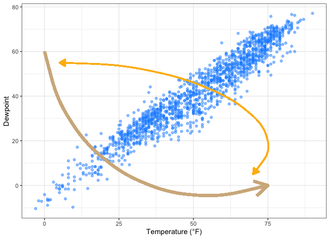
在绘图中添加曲线和箭头
annotate(geom=curve) 添加曲线。如果你喜欢,也可以添加直线:1 | g + |
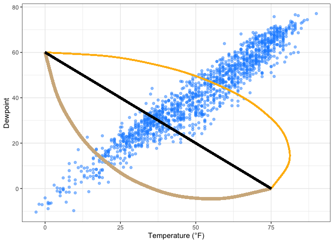
同样的几何图形也可以用来画箭头:1
2
3
4
5
6
7
8
9
10g +
annotate(geom = "curve", x = 0, y = 60, xend = 75, yend = 0,
color = "tan", linewidth = 2,
arrow = arrow(length = unit(0.07, "npc"))) +
annotate(geom = "curve", x = 5, y = 55, xend = 70, yend = 5,
curvature = -0.7, angle = 45,
color = "darkgoldenrod1", linewidth = 1,
arrow = arrow(length = unit(0.03, "npc"),
type = "closed",
ends = "both"))
文本
为数据添加标签
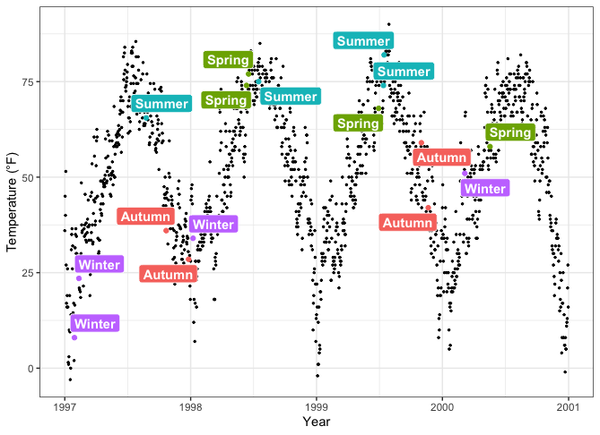
有时,我们想给数据点贴标签。为了避免文本标签的叠加和挤占,我们使用原始数据的 1% 样本,平均代表四个季节。我们正在使用geom_label() ,它带有一个名为label 的新美学:1
2
3
4
5
6
7
8
9
10
11
12
13
14
15
16set.seed(2020)
sample <- chic |>
dplyr::group_by(season) |>
dplyr::sample_frac(0.01)
## code without pipes:
## sample <- sample_frac(group_by(chic, season), .01)
ggplot(sample, aes(x = date, y = temp, color = season)) +
geom_point() +
geom_label(aes(label = season), hjust = .5, vjust = -.5) +
labs(x = "Year", y = "Temperature (°F)") +
xlim(as.Date(c('1997-01-01', '2000-12-31'))) +
ylim(c(0, 90)) +
theme(legend.position = "none")
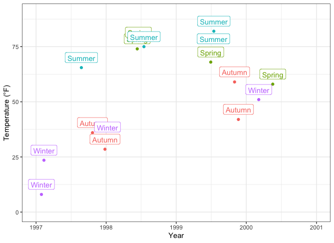
好吧,避免标签重叠的方法并不奏效。不过别担心,我们马上就能解决!
💁如果不喜欢标签周围的方框,也可以使用 geom_text()。展开查看示例。
1 | ggplot(sample, aes(x = date, y = temp, color = season)) + |
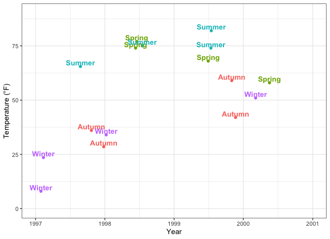
{ggrepel}软件包为{ggplot2}提供了一些很棒的实用工具,如上面的示例中,它为{ggplot2}提供了geom ,用于排斥重叠的文本。我们只需将geom_text() 替换为geom_text_repel() ,将geom_label() 替换为geom_label_repel() 即可:1
2
3
4
5
6
7library(ggrepel)
ggplot(sample, aes(x = date, y = temp, color = season)) +
geom_point() +
geom_label_repel(aes(label = season), fontface = "bold") +
labs(x = "Year", y = "Temperature (°F)") +
theme(legend.position = "none")
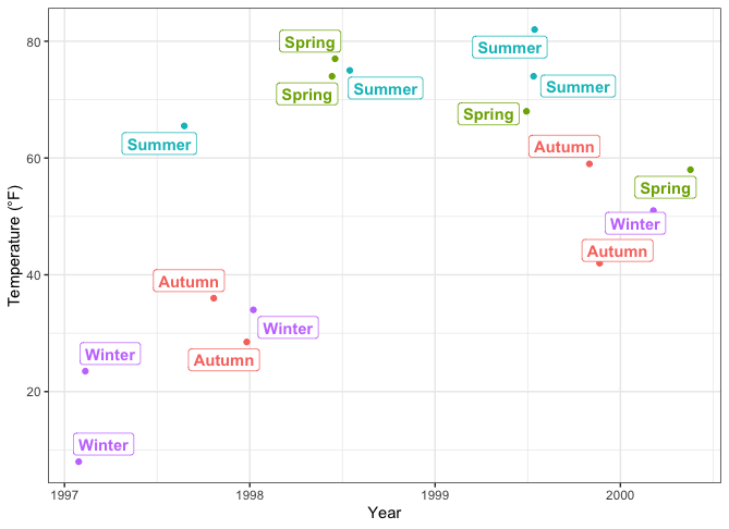
填充后的方框可能看起来更漂亮,因此我们将season 映射为fill ,而不是color ,并为文本设置白色:1
2
3
4
5
6
7
8ggplot(sample, aes(x = date, y = temp)) +
geom_point(data = chic, size = .5) +
geom_point(aes(color = season), size = 1.5) +
geom_label_repel(aes(label = season, fill = season),
color = "white", fontface = "bold",
segment.color = "grey30") +
labs(x = "Year", y = "Temperature (°F)") +
theme(legend.position = "none")
通过使用geom_text_repel() ,这也适用于纯文本标签。请查看所有使用示例。
添加文本注释
在 ggplot 中添加注释有多种方法。我们可以再次使用annotate(geom=text) 、annotate(geom=label) 、geom_text() 或geom_label() 1
2
3
4
5
6
7
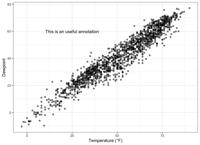
8g <-
ggplot(chic, aes(x = temp, y = dewpoint)) +
geom_point(alpha = .5) +
labs(x = "Temperature (°F)", y = "Dewpoint")
g +
annotate(geom = "text", x = 25, y = 60, fontface = "bold",
label = "This is a useful annotation")
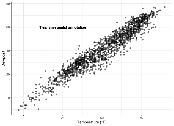
但是,现在 ggplot 为每个数据点绘制了一个文本标签—即 1,461 个标签,你只能看到一个!您可以将stat 参数设置为unique 来解决这个问题:1
2
3
4g +
geom_text(aes(x = 25, y = 60,
label = "This is a useful annotation"),
stat = "unique")
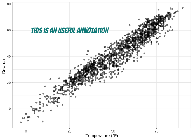
当然,我们也可以更改显示文本的属性:1
2
3
4
5g +
geom_text(aes(x = 25, y = 60,
label = "This is a useful annotation"),
stat = "unique", family = "Bangers",
size = 7, color = "darkcyan")
如果您使用其中一个面函数来可视化数据,可能会遇到麻烦。首先,您可能只想包含一次注释:1
2
3
4
5
6
7
8
9
10
11
12
13
14
15
16
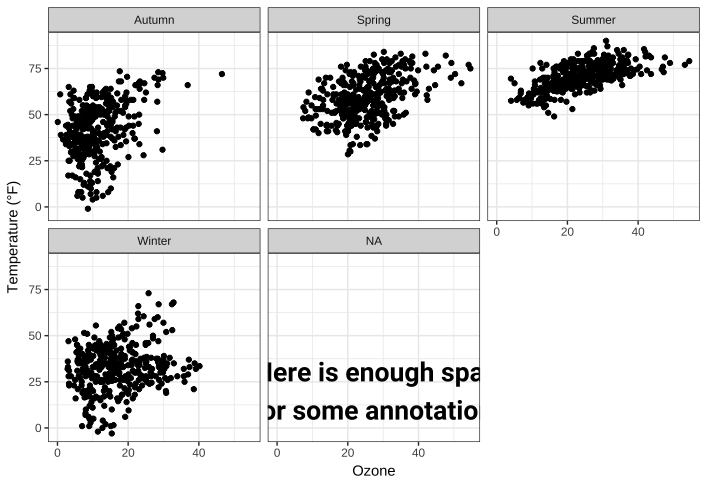
17ann <- data.frame(
o3 = 30,
temp = 20,
season = factor("Summer", levels = levels(chic$season)),
label = "Here is enough space\nfor some annotations."
)
g <-
ggplot(chic, aes(x = o3, y = temp)) +
geom_point() +
labs(x = "Ozone", y = "Temperature (°F)")
g +
geom_text(data = ann, aes(label = label),
size = 7, fontface = "bold",
family = "Roboto Condensed") +
facet_wrap(~season)
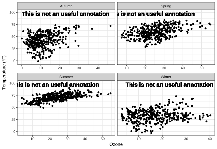
另一个挑战是分面与自由刻度的结合,这可能会削减你的文字:1
2
3
4
5
6g +
geom_text(aes(x = 23, y = 97,
label = "This is not a useful annotation"),
size = 5, fontface = "bold") +
scale_y_continuous(limits = c(NA, 100)) +
facet_wrap(~season, scales = "free_x")
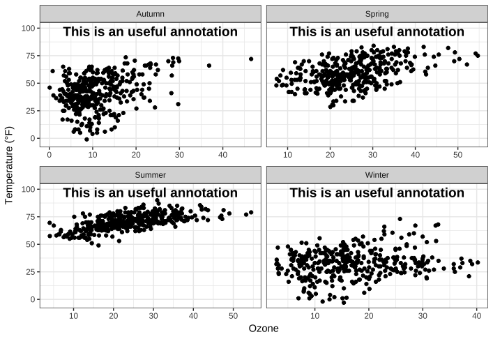
一种解决方案是事先计算出坐标轴的中点,这里是x :1
2
3
4
5
6
7
8
9ann <-
chic |>
dplyr::group_by(season) |>
dplyr::summarize(
o3 = min(o3, na.rm = TRUE) +
(max(o3, na.rm = TRUE) - min(o3, na.rm = TRUE)) / 2
)
ann1
2
3
4
5
6
7## # A tibble: 4 × 2
## season o3
## <fct> <dbl>
## 1 Winter 21.5
## 2 Spring 31.0
## 3 Summer 29.2
## 4 Autumn 23.3
……并使用合计数据指定注释的位置:1
2
3
4
5
6
7g +
geom_text(data = ann,
aes(x = o3, y = 97,
label = "This is a useful annotation"),
size = 5, fontface = "bold") +
scale_y_continuous(limits = c(NA, 100)) +
facet_wrap(~season, scales = "free_x")
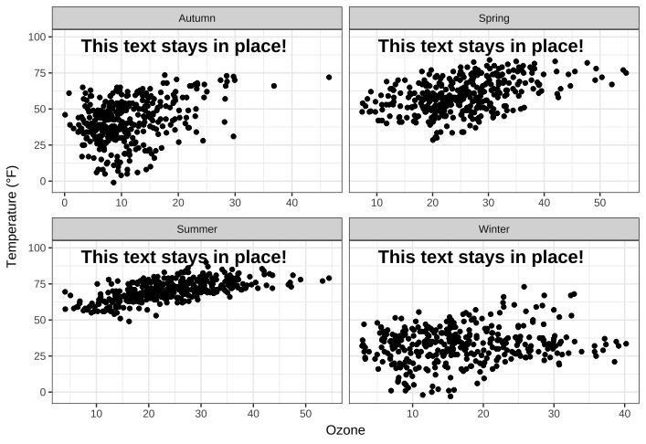
不过,还有一种更简单的方法(在固定坐标方面)—但也需要花些时间熟记代码。{grid}软件包与{ggplot2}的annotation_custom() 结合使用,可以根据比例坐标指定位置,其中 0 代表低,1 代表高。grobTree() 创建网格图形对象,textGrob 创建文本图形对象。当您有多个不同比例的绘图时,这种方法的价值尤为明显。1
2
3
4
5
6
7
8
9
10
11library(grid)
my_grob <- grobTree(textGrob("This text stays in place!",
x = .1, y = .9, hjust = 0,
gp = gpar(col = "black",
fontsize = 15,
fontface = "bold")))
g +
annotation_custom(my_grob) +
facet_wrap(~season, scales = "free_x") +
scale_y_continuous(limits = c(NA, 100))
使用 Markdown 和 HTML 渲染注释
我们再次使用 Claus Wilke 的 {ggtext} 软件包,该软件包旨在改进 {ggplot2} 的文本渲染支持。{ggtext}软件包定义了两个新的主题元素:element_markdown() 和 element_textbox() 。geom_richtext() 可替代geom_text() 和geom_label() ,并将文本渲染为标记符…
1 | library(ggtext) |
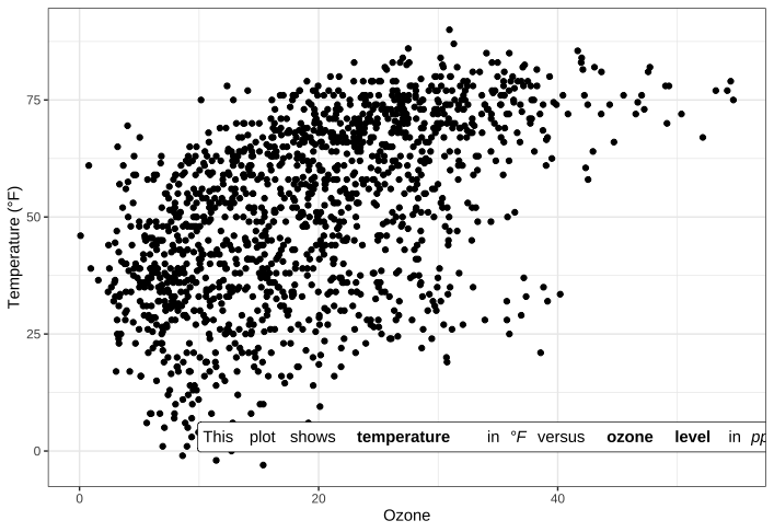
… 或 html:1
2
3
4
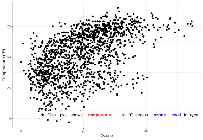
5lab_html <- "★ This plot shows <b style='color:red;'>temperature</b> in <i>°F</i> versus <b style='color:blue;'>ozone level</b>in <i>ppm</i> ★"
g +
geom_richtext(aes(x = 33, y = 3, label = lab_html),
stat = "unique")
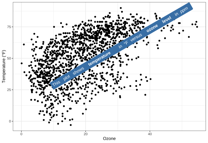
geom 附带了许多可以修改的细节,例如角度(默认的geom_text() 和geom_label() 无法修改)、方框属性和文本属性。1
2
3
4
5
6g +
geom_richtext(aes(x = 10, y = 25, label = lab_md),
stat = "unique", angle = 30,
color = "white", fill = "steelblue",
label.color = NA, hjust = 0, vjust = 0,
family = "Playfair Display")
来自 {ggtext} 软件包的另一个 geom 是geom_textbox() 。该 geom 允许对字符串进行动态包装,这对信息框和字幕等较长的注释非常有用。1
2
3
4
5lab_long <- "**Lorem ipsum dolor**<br><i style='font-size:8pt;color:red;'>Lorem ipsum dolor sit amet, consectetur adipiscing elit, sed do eiusmod tempor incididunt ut labore et dolore magna aliqua.<br>Ut enim ad minim veniam, quis nostrud exercitation ullamco laboris nisi ut aliquip ex ea commodo consequat.</i>"
g +
geom_textbox(aes(x = 40, y = 10, label = lab_long),
width = unit(15, "lines"), stat = "unique")
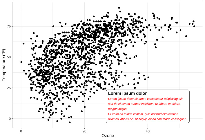
请注意,既不能旋转文本框(始终水平),也不能更改文本的对齐方式(始终左对齐)。
坐标系
翻转图片
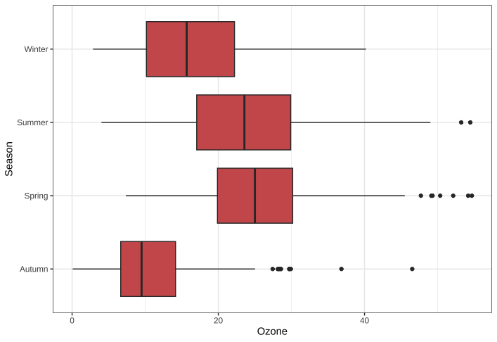
翻转图片非常容易。我在这里添加了 coord_flip(),这就是翻转绘图所需的全部功能。这在使用几何图形表示分类数据(例如条形图或下面示例中的方框图和胡须图)时最有意义:1
2
3
4ggplot(chic, aes(x = season, y = o3)) +
geom_boxplot(fill = "indianred") +
labs(x = "Season", y = "Ozone") +
coord_flip()
💁自{ggplot2}3.0.0版起,也可以通过参数orientation = y水平绘制几何图形。展开查看示例。
1 | ggplot(chic, aes(x = o3, y = season)) + |
固定轴
我们可以固定笛卡尔坐标系的纵横比,并强制沿 x 轴和 y 轴对单位进行物理表示:1
2
3
4
5ggplot(chic, aes(x = temp, y = o3)) +
geom_point() +
labs(x = "Temperature (°F)", y = "Ozone Level") +
scale_x_continuous(breaks = seq(0, 80, by = 20)) +
coord_fixed(ratio = 1)
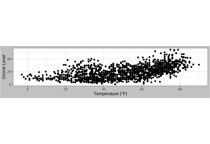
这样不仅可以确保坐标轴上的固定步长,还可以确保导出的绘图看起来符合预期。不过,如果您没有使用合适的纵横比,您保存的绘图可能会包含大量空白:1
2
3
4
5
6ggplot(chic, aes(x = temp, y = o3)) +
geom_point() +
labs(x = "Temperature (°F)", y = "Ozone Level") +
scale_x_continuous(breaks = seq(0, 80, by = 20)) +
coord_fixed(ratio = 1/3) +
theme(plot.background = element_rect(fill = "grey80"))
逆转轴
您还可以分别使用scale_x_reverse() 或scale_y_reverse() 轻松地反转坐标轴:1
2
3
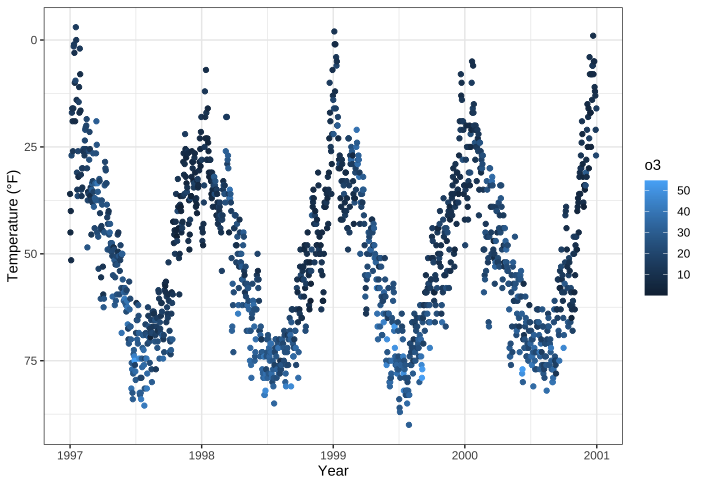
4ggplot(chic, aes(x = date, y = temp, color = o3)) +
geom_point() +
labs(x = "Year", y = "Temperature (°F)") +
scale_y_reverse()
💁请注意,这只适用于连续数据。如果要反转分类数据,请使用forcats软件包中的fct_rev()函数。展开查看示例。} 1
2
3
4
## the default
ggplot(chic, aes(x = temp, y = season)) +
geom_jitter(aes(color = season), show.legend = FALSE) +
labs(x = "Temperature (°F)", y = NULL)
{% image https://bu.dusays.com/2023/09/08/64fa1b511e951.png
1 | ## the default |
1 | library(forcats) |
转换轴线
… 或者使用scale_y_log10() 或scale_y_sqrt() 转换默认线性映射。下面是一个 log10 转换轴的示例(在这种情况下会引入 NA,因此要小心):1
2
3
4ggplot(chic, aes(x = date, y = temp, color = o3)) +
geom_point() +
labs(x = "Year", y = "Temperature (°F)") +
scale_y_log10(lim = c(0.1, 100))
将图片环化
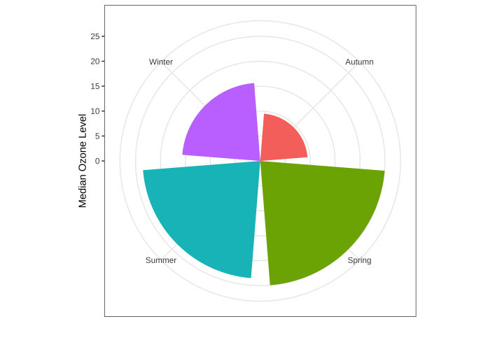
此外,还可以通过调用coord_polar() 对坐标系进行圆化(极化?)1
2
3
4
5
6
7
8chic |>
dplyr::group_by(season) |>
dplyr::summarize(o3 = median(o3)) |>
ggplot(aes(x = season, y = o3)) +
geom_col(aes(fill = season), color = NA) +
labs(x = "", y = "Median Ozone Level") +
coord_polar() +
guides(fill = "none")
这种坐标系还可以绘制饼图:
1 | chic_sum <- |
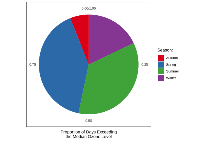
我建议在笛卡尔坐标系(默认坐标系)下也查看相同代码的结果,以了解coord_polar() 和theta 背后的逻辑:1
2
3
4
5
6
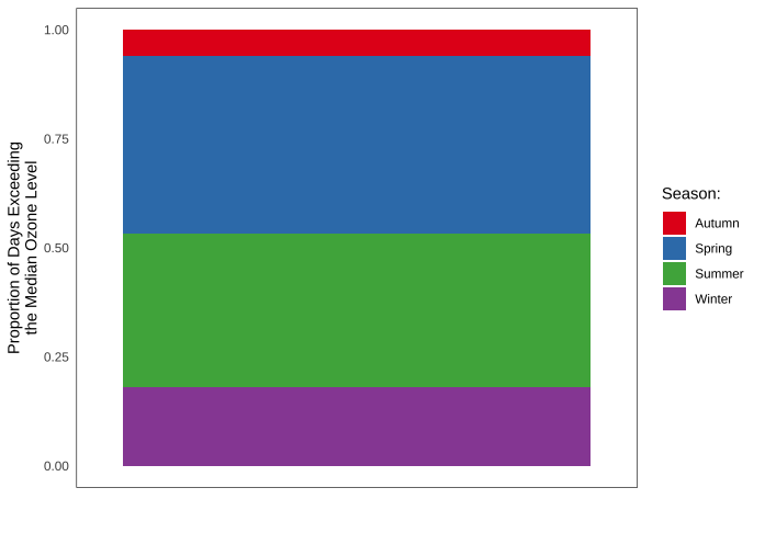
7ggplot(chic_sum, aes(x = "", y = rel)) +
geom_col(aes(fill = season), width = 1, color = NA) +
labs(x = "", y = "Proportion of Days Exceeding\nthe Median Ozone Level") +
#coord_polar(theta = "y") +
scale_fill_brewer(palette = "Set1", name = "Season:") +
theme(axis.ticks = element_blank(),
panel.grid = element_blank())
图表类型
箱性图的替代方案
方框图很棒,但也可能非常无聊。另外,即使您习惯于箱形图,也要记住,可能有很多人在看您的图时从未见过箱形图和须状图。
💁展开,简要回顾箱形图和须线图。
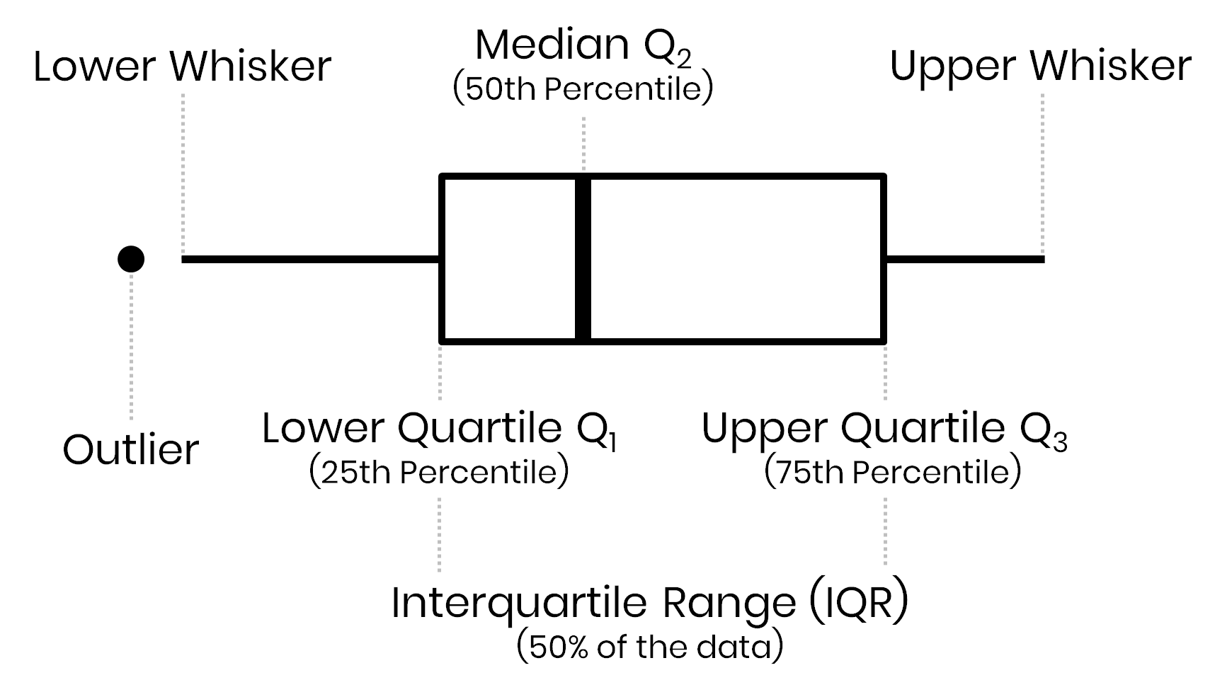
箱-须图(有时简称箱图)是一种类似直方图的数据显示方法,由 J. Tukey 发明。中间粗线表示中位数,也称为四分位数 Q2。方框的界限由下四分位数 Q1 和上四分位数 Q3 决定。因此,方框包含 50%的数据,称为 “四分位数间距”(IQR)。晶须的长度由不被视为异常值的最极端值(即四分位数间距的 3/2 倍以内的值)决定。
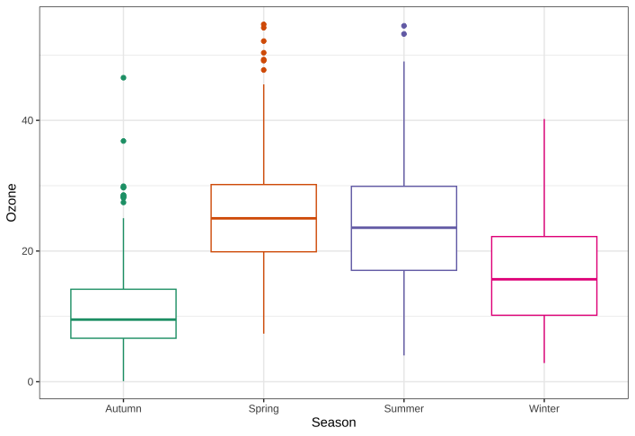
还有其他方法,但首先我们要绘制一个普通的箱形图:1
2
3
4
5
6
7g <-
ggplot(chic, aes(x = season, y = o3,
color = season)) +
labs(x = "Season", y = "Ozone") +
scale_color_brewer(palette = "Dark2", guide = "none")
g + geom_boxplot()
- 替代方案:点阵图
让我们只绘制原始数据中的每个数据点:1
g + geom_point()

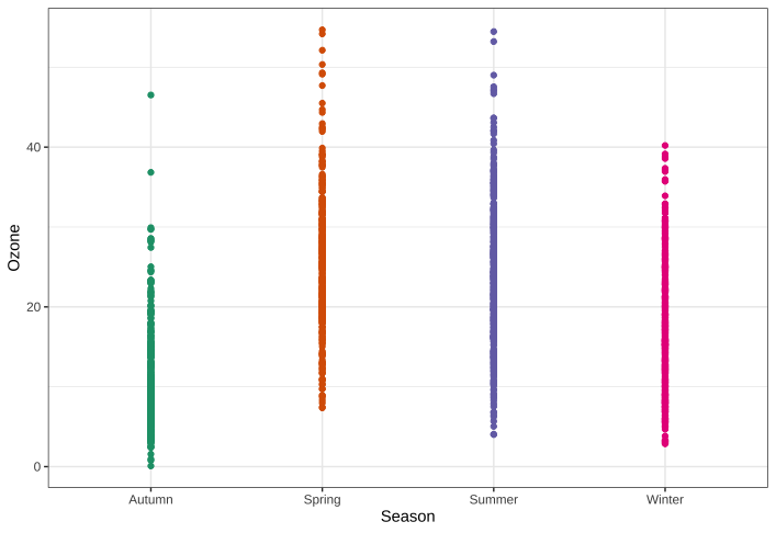
不仅乏味,而且没有信息量。为了改善情节,可以增加透明度,以解决情节过多的问题:1
g + geom_point(alpha = .1)
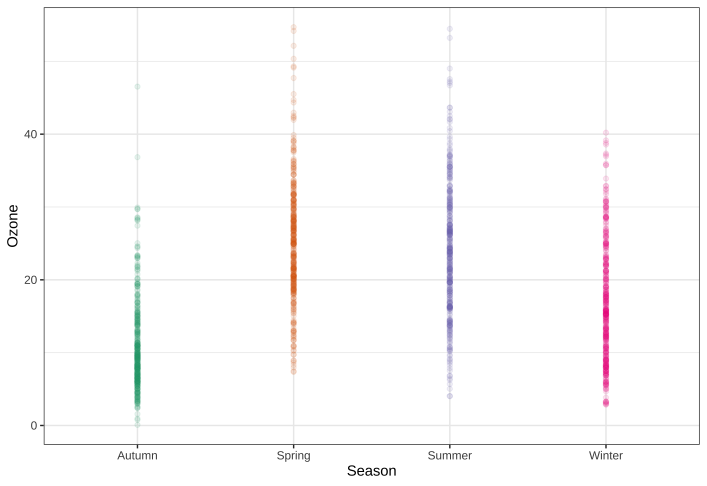
然而,在这里设置透明度是很困难的,因为要么重叠度太高,要么极值不明显。很糟糕,所以让我们试试其他方法。
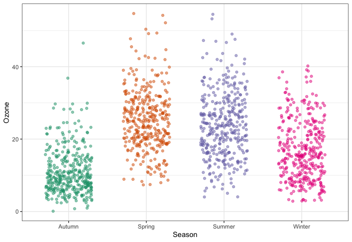
- 替代方案:抖动点图
尝试给数据添加一点抖动。我喜欢在内部可视化中使用这种方法,但要小心使用抖动,因为你是在故意给数据添加噪音,这可能会导致对数据的误读。1
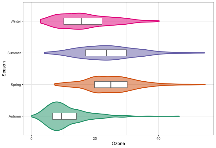
g + geom_jitter(width = .3, alpha = .5)
替代方案:小提琴图
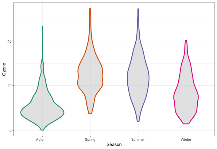
小提琴图(Violin plots)与箱形图类似,只是使用核密度来显示数据最多的地方,是一种有用的可视化方法。1
g + geom_violin(fill = "gray80", linewidth = 1, alpha = .5)
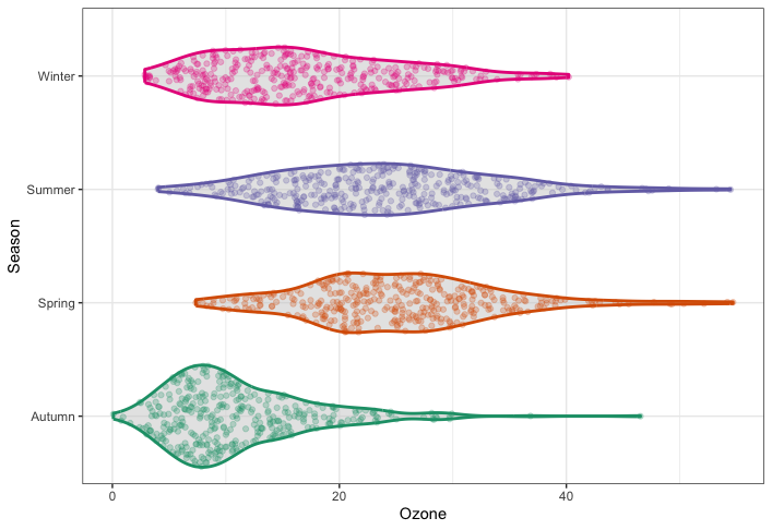
替代方案 将小提琴图与抖动相结合
当然,我们可以将估计密度和原始数据点两者结合起来:1
2
3g + geom_violin(fill = "gray80", linewidth = 1, alpha = .5) +
geom_jitter(alpha = .25, width = .3) +
coord_flip()

{ggforce}软件包提供了所谓的 sina 函数,抖动的宽度由数据的密度分布控制,这使得抖动在视觉上更有吸引力:1
2
3
4
5library(ggforce)
g + geom_violin(fill = "gray80", linewidth = 1, alpha = .5) +
geom_sina(alpha = .25) +
coord_flip()
- 替代方案 将小提琴图与方框图相结合
为了便于估算量化值,我们还可以在方框图的小提琴内部添加方框,以表示 25% 四分位数、中位数和 75% 四分位数:1
2
3
4
5g + geom_violin(aes(fill = season), linewidth = 1, alpha = .5) +
geom_boxplot(outlier.alpha = 0, coef = 0,
color = "gray40", width = .2) +
scale_fill_brewer(palette = "Dark2", guide = "none") +
coord_flip()
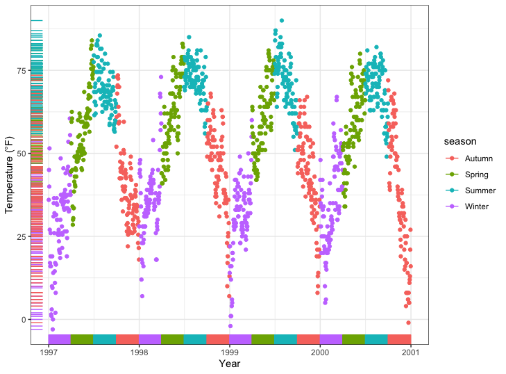
为绘图创建 Rug 表示法
轴须图表示单个定量变量的数据,以沿坐标轴的标记形式显示。在大多数情况下,除散点图或热图之外,它还用于直观显示一个或两个变量的总体分布情况:1
2
3
4
5ggplot(chic, aes(x = date, y = temp,
color = season)) +
geom_point(show.legend = FALSE) +
geom_rug(show.legend = FALSE) +
labs(x = "Year", y = "Temperature (°F)")
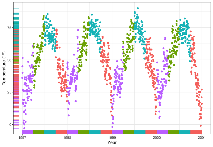
1 | ggplot(chic, aes(x = date, y = temp, color = season)) + |
创建相关性矩阵
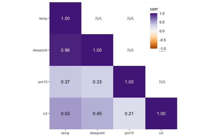
有几个软件包可以创建相关矩阵图,其中一些还使用了{ggplot2}基础架构,从而返回 ggplots。下面我将向大家展示如何在不使用扩展软件包的情况下创建相关矩阵图。
第一步是创建相关矩阵。在这里,我们使用的是 {corrr} 软件包,它可以很好地与管道配合使用,但也有很多其他软件。我们使用皮尔逊相关矩阵,因为所有变量的分布都比较正态(如果变量的分布模式不同,也可以考虑使用斯皮尔曼相关矩阵)。请注意,由于相关矩阵有冗余信息,因此我们将其中一半设置为NA 。1
2
3
4
5
6
7corm <-
chic |>
dplyr::select(temp, dewpoint, pm10, o3) |>
corrr::correlate(diagonal = 1) |>
corrr::shave(upper = FALSE)
corm1
2
3
4
5
6
7## # A tibble: 4 × 5
## term temp dewpoint pm10 o3
## <chr> <dbl> <dbl> <dbl> <dbl>
## 1 temp 1 0.958 0.368 0.535
## 2 dewpoint NA 1 0.327 0.454
## 3 pm10 NA NA 1 0.206
## 4 o3 NA NA NA 1
现在,我们使用 {tidyr} 软件包中的pivot_longer() 函数将得到的矩阵转换为长格式。我们还将直接格式化标签,并为上三角加上空引号。请注意,我使用了sprintf() 来确保标签始终显示两位数。1
2
3
4
5
6
7
8
9
10
11corm <- corm |>
tidyr::pivot_longer(
cols = -term,
names_to = "colname",
values_to = "corr"
) |>
dplyr::mutate(
rowname = forcats::fct_inorder(term),
colname = forcats::fct_inorder(colname),
label = dplyr::if_else(is.na(corr), "", sprintf("%1.2f", corr))
)1
2
3
4
5
6
7
8
9
10
11
12
13
14
15
16
17
18
19## # A tibble: 16 × 5
## term colname corr rowname label
## <chr> <fct> <dbl> <fct> <chr>
## 1 temp temp 1 temp "1.00"
## 2 temp dewpoint 0.958 temp "0.96"
## 3 temp pm10 0.368 temp "0.37"
## 4 temp o3 0.535 temp "0.53"
## 5 dewpoint temp NA dewpoint ""
## 6 dewpoint dewpoint 1 dewpoint "1.00"
## 7 dewpoint pm10 0.327 dewpoint "0.33"
## 8 dewpoint o3 0.454 dewpoint "0.45"
## 9 pm10 temp NA pm10 ""
## 10 pm10 dewpoint NA pm10 ""
## 11 pm10 pm10 1 pm10 "1.00"
## 12 pm10 o3 0.206 pm10 "0.21"
## 13 o3 temp NA o3 ""
## 14 o3 dewpoint NA o3 ""
## 15 o3 pm10 NA o3 ""
## 16 o3 o3 1 o3 "1.00"
我们将使用geom_tile() 绘制热图,使用geom_text() 绘制标签:1
2
3
4
5
6ggplot(corm, aes(rowname, fct_rev(colname),
fill = corr)) +
geom_tile() +
geom_text(aes(label = label)) +
coord_fixed() +
labs(x = NULL, y = NULL)
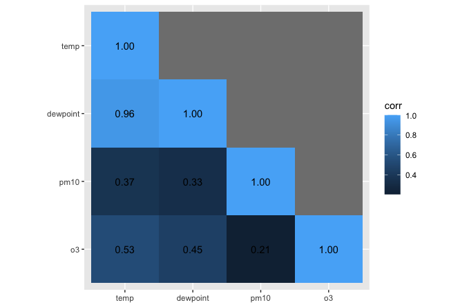
我喜欢使用发散的调色板—重要的是,刻度要以零相关性为中心!白色表示数据缺失。此外,我还喜欢热图周围没有网格线和衬垫,标签的颜色取决于底层填充物1
2
3
4
5
6
7
8
9
10
11
12
13
14
15
16
17
18
19
20ggplot(corm, aes(rowname, fct_rev(colname),
fill = corr)) +
geom_tile() +
geom_text(aes(
label = label,
color = abs(corr) < .75
)) +
coord_fixed(expand = FALSE) +
scale_color_manual(
values = c("white", "black"),
guide = "none"
) +
scale_fill_distiller(
palette = "PuOr", na.value = "white",
direction = 1, limits = c(-1, 1),
name = "Pearson\nCorrelation:"
) +
labs(x = NULL, y = NULL) +
theme(panel.border = element_rect(color = NA, fill = NA),
legend.position = c(.85, .8))
创建等高线图
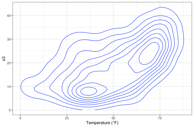
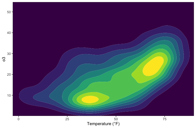
等值线图是显示数值等距的好方法。我们可以用它来对数据进行分选,显示观测值的密度:1
2
3ggplot(chic, aes(temp, o3)) +
geom_density_2d() +
labs(x = "Temperature (°F)", x = "Ozone Level")
1 | ggplot(chic, aes(temp, o3)) + |
但现在,我们正在绘制三维数据。我们将绘制露点(即空气中水蒸气凝结成液态露水的温度)与温度和臭氧水平相关的临界值:1
2
3
4
5
6
7
8
9
10
11
12
13
14
15
16
17
18
19
20
21## interpolate data
fld <- with(chic, akima::interp(x = temp, y = o3, z = dewpoint))
## prepare data in long format
df <- fld$z |>
tibble::as_tibble(.name_repair = "universal_quiet") |>
dplyr::mutate(x = dplyr::row_number()) |>
tidyr::pivot_longer(
cols = -x,
names_to = "y",
names_transform = as.integer,
values_to = "Dewpoint",
names_prefix = "...",
values_drop_na = TRUE
)
g <- ggplot(data = df, aes(x = x, y = y, z = Dewpoint)) +
labs(x = "Temperature (°F)", y = "Ozone Level",
color = "Dewpoint")
g + stat_contour(aes(color = after_stat(level)))
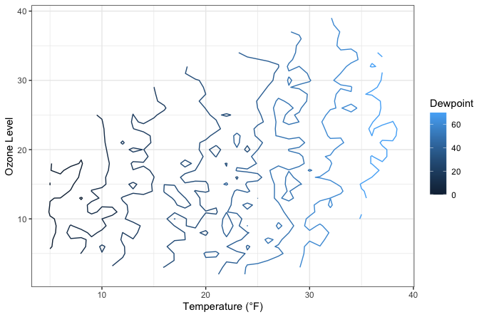
惊喜 根据定义,拔模点在大多数情况下等于测量温度。
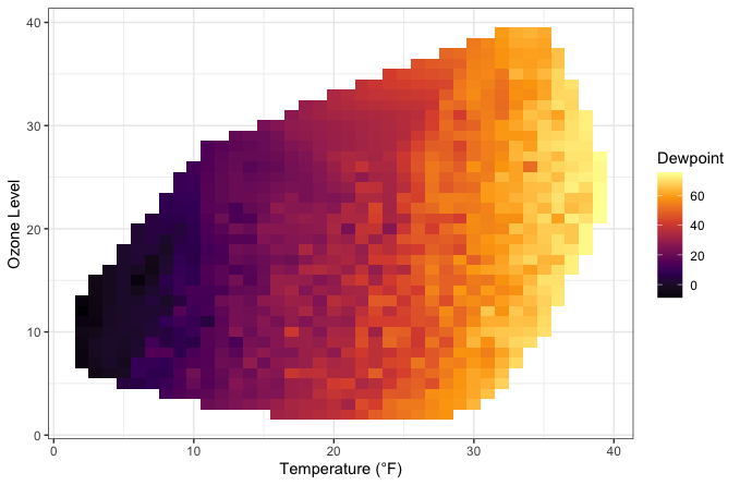
这些线条表示不同等级的露点,但这幅图并不美观,而且由于边框缺失,很难阅读。让我们尝试使用 viridis 调色板绘制一幅瓦片图,对臭氧水平和温度的每种组合的露点进行编码:
1 | g + geom_tile(aes(fill = Dewpoint)) + |
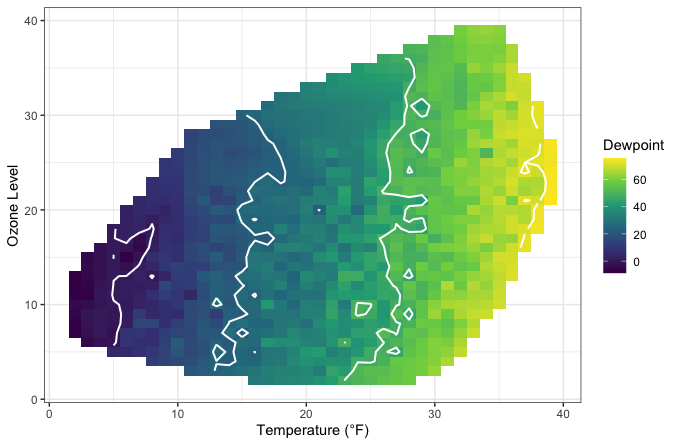
如果我们将等高线图和瓦片图结合起来,填充等高线下的区域,效果会如何?1
2
3g + geom_tile(aes(fill = Dewpoint)) +
stat_contour(color = "white", linewidth = .7, bins = 5) +
scale_fill_viridis_c()
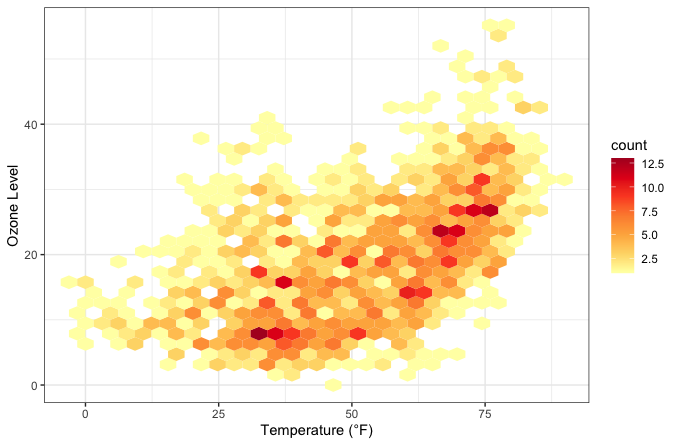
创建计数热图
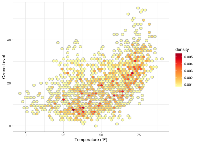
与第一幅等高线图类似,我们也可以通过geom_hex() ,轻松显示按六边形网格划分的点的计数或密度:1
2
3
4ggplot(chic, aes(temp, o3)) +
geom_hex() +
scale_fill_distiller(palette = "YlOrRd", direction = 1) +
labs(x = "Temperature (°F)", y = "Ozone Level")
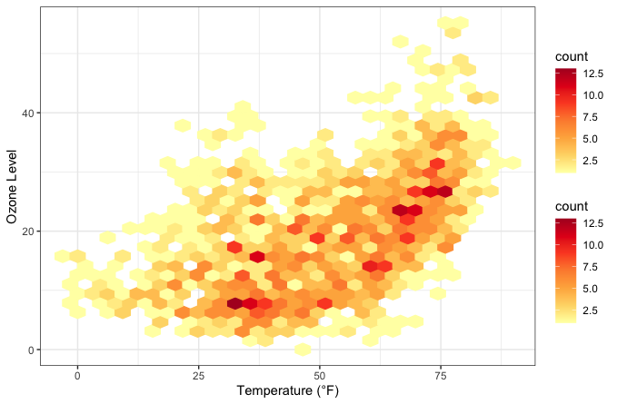
通常情况下,结果图中会出现白线。可以通过将颜色映射到after_stat(count) (默认值)或 after_stat(density) 来解决这个问题…1
2
3
4
5ggplot(chic, aes(temp, o3)) +
geom_hex(aes(color = after_stat(count))) +
scale_fill_distiller(palette = "YlOrRd", direction = 1) +
scale_color_distiller(palette = "YlOrRd", direction = 1) +
labs(x = "Temperature (°F)", y = "Ozone Level")
… 或为所有六边形单元格设置相同的轮廓颜色:1
2
3
4ggplot(chic, aes(temp, o3)) +
geom_hex(color = "grey") +
scale_fill_distiller(palette = "YlOrRd", direction = 1) +
labs(x = "Temperature (°F)", y = "Ozone Level")
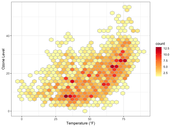
还可以更改默认的分档,以增加或减少六边形单元的数量:1
2
3
4ggplot(chic, aes(temp, o3, fill = after_stat(density))) +
geom_hex(bins = 50, color = "grey") +
scale_fill_distiller(palette = "YlOrRd", direction = 1) +
labs(x = "Temperature (°F)", y = "Ozone Level")
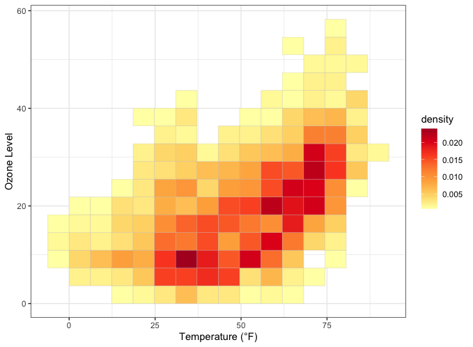
如果想使用规则网格,也可以使用geom_bin2d() ,它可以将数据汇总到基于bins 的矩形网格单元中:1
2
3
4ggplot(chic, aes(temp, o3, fill = after_stat(density))) +
geom_bin2d(bins = 15, color = "grey") +
scale_fill_distiller(palette = "YlOrRd", direction = 1) +
labs(x = "Temperature (°F)", y = "Ozone Level")
创建山脊图
山脊图是一种新型图形,目前非常流行。
虽然您可以使用基本的 {ggplot2} 命令来创建这些图,但由于流行,我们开发了一个软件包,可以更轻松地创建这些图: {ggridges}。我们将在这里使用这个软件包。
1 | library(ggridges) |
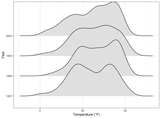
你可以分别使用参数rel_min_height 和scale 来轻松指定重叠部分和尾部。该软件包还自带主题(但我更喜欢创建自己的主题,参见 “创建和使用自定义主题 “一章)。此外,我们还会根据年份改变颜色,使其更吸引人。1
2
3
4
5
6ggplot(chic, aes(x = temp, y = factor(year), fill = year)) +
geom_density_ridges(alpha = .8, color = "white",
scale = 2.5, rel_min_height = .01) +
labs(x = "Temperature (°F)", y = "Year") +
guides(fill = "none") +
theme_ridges()
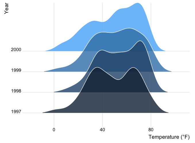
您也可以使用低于 1 的缩放参数值来消除重叠(但这与脊图的理念相悖……)。下面是一个额外使用 viridis 颜色梯度和内置主题的示例:1
2
3
4
5
6ggplot(chic, aes(x = temp, y = season, fill = after_stat(x))) +
geom_density_ridges_gradient(scale = .9, gradient_lwd = .5,
color = "black") +
scale_fill_viridis_c(option = "plasma", name = "") +
labs(x = "Temperature (°F)", y = "Season") +
theme_ridges(font_family = "Roboto Condensed", grid = FALSE)
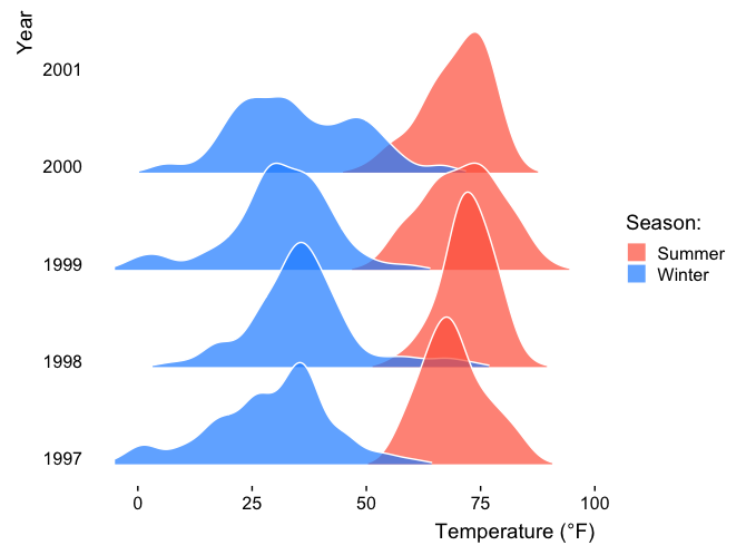
我们还可以比较每条山脊线的几个组别,并根据组别进行着色。这与马克-贝尔尊斯(Marc Belzunces)的想法不谋而合。1
2
3
4
5
6
7
8
9
10
11
12
13
14library(dplyr)
## only plot extreme season using dplyr from the tidyverse
ggplot(data = dplyr::filter(chic, season %in% c("Summer", "Winter")),
aes(x = temp, y = year, fill = paste(year, season))) +
geom_density_ridges(alpha = .7, rel_min_height = .01,
color = "white", from = -5, to = 95) +
scale_fill_cyclical(breaks = c("1997 Summer", "1997 Winter"),
labels = c(`1997 Summer` = "Summer",
`1997 Winter` = "Winter"),
values = c("tomato", "dodgerblue"),
name = "Season:", guide = "legend") +
theme_ridges(grid = FALSE) +
labs(x = "Temperature (°F)", y = "Year")
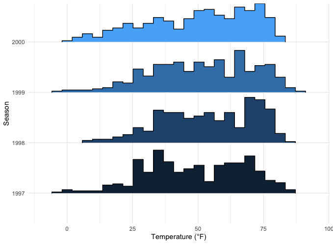
在geom_density_ridges() 命令中使用stat ,{ggridges}软件包还可以帮助创建不同组别的直方图:1
2
3
4
5ggplot(chic, aes(x = temp, y = factor(year), fill = year)) +
geom_density_ridges(stat = "binline", bins = 25, scale = .9,
draw_baseline = FALSE, show.legend = FALSE) +
theme_minimal() +
labs(x = "Temperature (°F)", y = "Season")
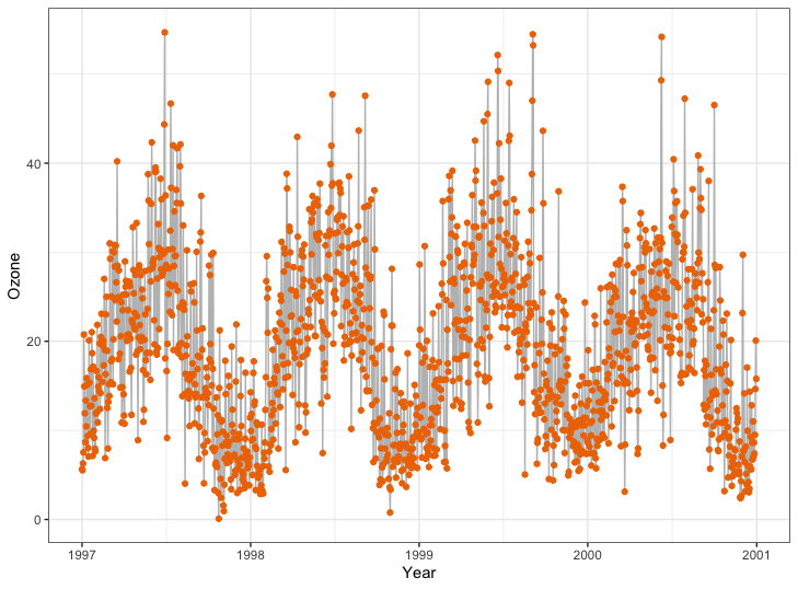
使用色带(AUC、CI 等)
这并不是一个完美的数据集,但使用ribbon 可以很有用。在这个示例中,我们将使用 filter() 函数创建一个 30 天的运行平均值,这样我们的数据带就不会太嘈杂。
1 | chic$o3run <- as.numeric(stats::filter(chic$o3, rep(1/30, 30), sides = 2)) |
如果我们使用geom_ribbon() 函数填充曲线下方的区域,效果会如何?1
2
3
4
5ggplot(chic, aes(x = date, y = o3run)) +
geom_ribbon(aes(ymin = 0, ymax = o3run),
fill = "orange", alpha = .4) +
geom_line(color = "chocolate", lwd = .8) +
labs(x = "Year", y = "Ozone")
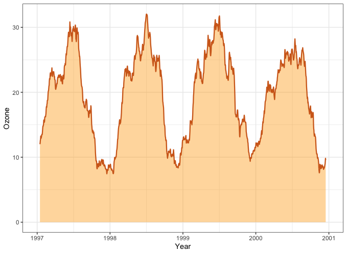
表示曲线下面积(AUC))很好,但这并不是使用 geom_ribbon() 的常规方法。
💁 实际上,geom_area() 是实现同样效果的更好方法。
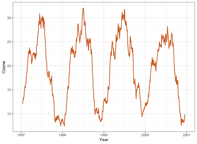
1 | ggplot(chic, aes(x = date, y = o3run)) + |
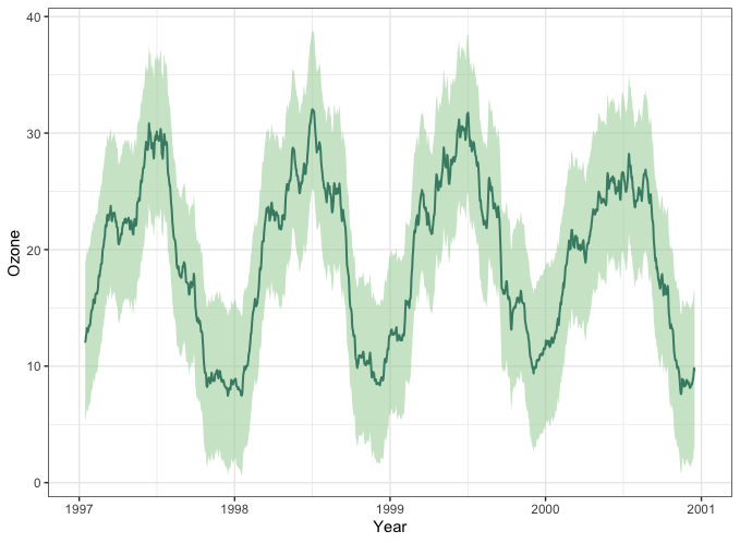
取而代之的是,我们画一条带状线,使我们的数据上下各有一个标准差:1
2
3
4
5
6
7
8chic$mino3 <- chic$o3run - sd(chic$o3run, na.rm = TRUE)
chic$maxo3 <- chic$o3run + sd(chic$o3run, na.rm = TRUE)
ggplot(chic, aes(x = date, y = o3run)) +
geom_ribbon(aes(ymin = mino3, ymax = maxo3), alpha = .5,
fill = "darkseagreen3", color = "transparent") +
geom_line(color = "aquamarine4", lwd = .7) +
labs(x = "Year", y = "Ozone")
平滑图
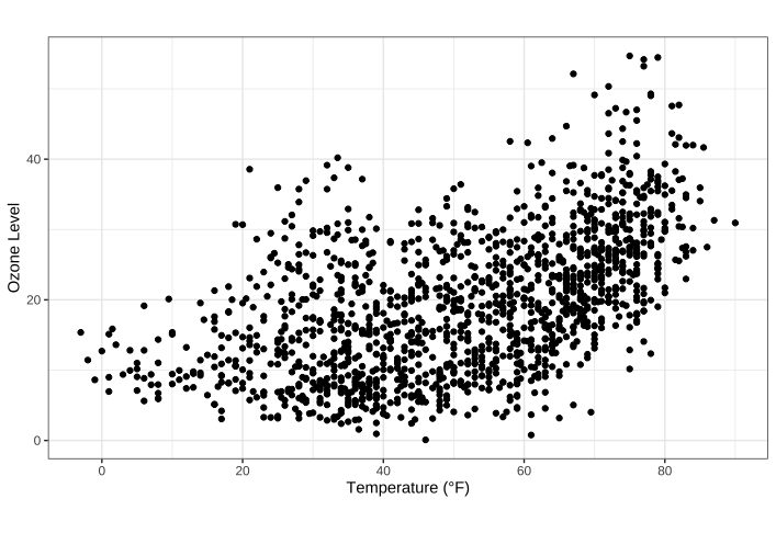
使用 {ggplot2} 为数据添加平滑处理非常简单。
默认值 添加 LOESS 或 GAM 平滑处理
您只需使用stat_smooth() ,甚至不需要公式。如果点数少于 1000 个,则添加 LOESS(局部加权散点图平滑,method=loess ),否则添加 GAM(广义相加模型,method= )。由于我们有超过 1000 个点,所以平滑是基于 GAM :1
2
3
4ggplot(chic, aes(x = date, y = temp)) +
geom_point(color = "gray40", alpha = .5) +
stat_smooth() +
labs(x = "Year", y = "Temperature (°F)") 1
## `geom_smooth()` using method = 'gam' and formula = 'y ~ s(x, bs = "cs")'
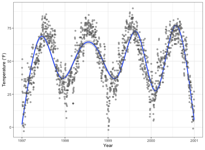
💡 在大多数情况下,我们希望点位于色带的顶部,因此请确保在添加点之前调用平滑。
添加线性拟合
虽然默认是 LOESS 或 GAM 平滑,但也可以轻松添加标准线性拟合:1
2
3
4
5ggplot(chic, aes(x = temp, y = dewpoint)) +
geom_point(color = "gray40", alpha = .5) +
stat_smooth(method = "lm", se = FALSE,
color = "firebrick", linewidth = 1.3) +
labs(x = "Temperature (°F)", y = "Dewpoint")
指定平滑公式
{ggplot2} 允许您指定要使用的模型。也许你想使用多项式回归?1
2
3
4
5
6
7
8
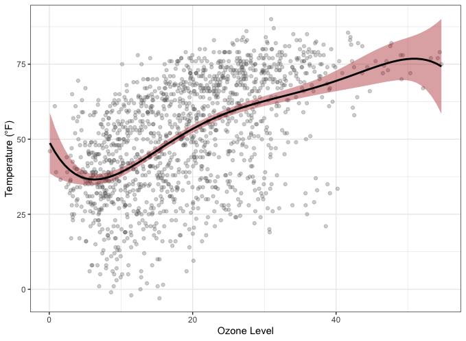
9ggplot(chic, aes(x = o3, y = temp)) +
geom_point(color = "gray40", alpha = .3) +
geom_smooth(
method = "lm",
formula = y ~ x + I(x^2) + I(x^3) + I(x^4) + I(x^5),
color = "black",
fill = "firebrick"
) +
labs(x = "Ozone Level", y = "Temperature (°F)")
💁 咦,geom_smooth()?geom和stat之间有重要区别,但在这里用哪个并不重要。展开以比较两者。
1 | ggplot(chic, aes(x = o3, y = temp)) + |
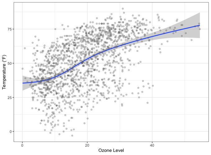
1 | ggplot(chic, aes(x = o3, y = temp)) + |
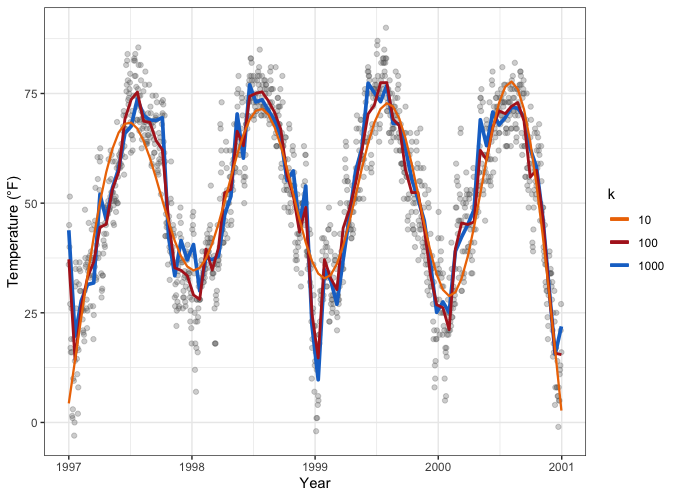
或者,假设您想增加 GAM 维度(在平滑的基础上增加一些额外的摆动):1
2
3
4
5
6
7
8
9
10
11
12
13
14
15
16
17
18cols <- c("darkorange2", "firebrick", "dodgerblue3")
ggplot(chic, aes(x = date, y = temp)) +
geom_point(color = "gray40", alpha = .3) +
stat_smooth(aes(col = "1000"),
method = "gam",
formula = y ~ s(x, k = 1000),
se = FALSE, linewidth = 1.3) +
stat_smooth(aes(col = "100"),
method = "gam",
formula = y ~ s(x, k = 100),
se = FALSE, linewidth = 1) +
stat_smooth(aes(col = "10"),
method = "gam",
formula = y ~ s(x, k = 10),
se = FALSE, linewidth = .8) +
scale_color_manual(name = "k", values = cols) +
labs(x = "Year", y = "Temperature (°F)")
交互式绘图
以下库集列出了可与 {ggplot2} 结合使用或单独使用的库,用于在 R 中创建交互式可视化(通常利用现有 JavaScript 库)。
{ggplot2}和{shiny}的组合
{shiny}是RStudio的一个软件包,它让使用R构建交互式网络应用变得异常简单。如需了解相关介绍和实例,请访问Shiny主页。
要了解其潜在用途,可以查看 Hello Shiny 示例。这是第一个:1
2library(shiny)
runExample("01_hello")
当然,我们也可以在这些应用程序中使用 ggplots。本例展示了添加一些交互式用户体验的可能性:1
runExample("04_mpg")
通过 {plotly} 和 {ggplot2} Plot.ly
Plot.ly是一款用于创建在线交互式图形和网络应用的工具。{plotly}软件包可以让你直接从{ggplot2}绘图中创建这些图形,而且工作流程出奇地简单,可以在R中完成。不过,你的一些主题设置可能会被更改,之后需要手动修改。此外,遗憾的是,创建能很好缩放的面图或真正的多面板图并不简单。1
2
3
4
5
6g <- ggplot(chic, aes(date, temp)) +
geom_line(color = "grey") +
geom_point(aes(color = season)) +
scale_color_brewer(palette = "Dark2", guide = "none") +
labs(x = NULL, y = "Temperature (°F)") +
theme_bw()
1 | library(plotly) |
例如,这里保留了整体主题设置,但再次添加了图例。
ggiraph 和 ggplot2
{ggiraph}是一个 R 软件包,可用于创建动态 {ggplot2} 图形。您可以在图形中添加工具提示、动画和 JavaScript 操作。在 Shiny 应用程序中使用该软件包时,还可以选择图形元素。
1 | library(ggiraph) |
Highcharts 通过 {highcharter}
Highcharts是一个用于交互式图表制作的软件库,它是另一个用纯JavaScript编写的可视化库,已被移植到R语言中。
1 | library(highcharter) |
Echarts 通过 {echarts4r}
Apache ECharts是一个免费、功能强大的图表和可视化库,提供了一种构建直观、交互式和高度可定制图表的简单方法。尽管它是用纯 JavaScript 编写的,但由于 John Coene 的功劳,人们可以通过 {echarts4r}库在 R 中使用它。请查看令人印象深刻的示例图库或软件包开发者John Coene制作的应用程序。
1 | library(echarts4r) |
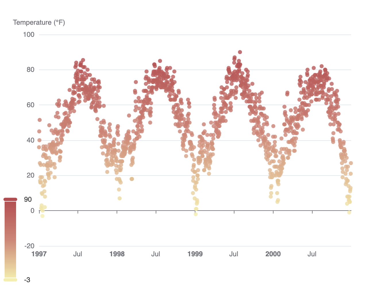
Chart.js 通过 {charter}
charter是 John Coene 开发的另一个软件包,可以在 R 中使用 JavaScript 可视化库。通过该软件包,您可以借助Charts.js框架构建交互式图表。
1 | library(charter) |
(该示例在 Rmarkdown 中不起作用)。
备注、提示和资源
在循环和函数中使用 ggplot2
lattice 和 ggplot2 中基于网格的图形函数会创建一个图形对象。在命令行下交互使用这些函数时,结果会自动打印出来,但在 source() 中或自己的函数中,则需要显式print() 语句,即我们大多数示例中的print(g) 。另请参见R的问答页面。
其他资源
- “ggplot2: Elegant Graphics for Data Analysis” by Hadley Wickham, available via open-access!
- “Fundamentals of Data Visualization” by Claus O. Wilke about data visualization in general but using - - {ggplot2}. (You can find the codes on his GitHub profile.)
- “Cookbook for R” by Winston Chang with recipes to produce R plots
- Gallery of the Top 50 ggplot2 visualizations
- Gallery of {ggplot2} extension packages
- How to extend {ggplot2} by Hadley Wickham
- The fantastic R4DS Online Learning Community that offers help and mentoring for all things related to - the content of the “R for Data Science” book by Hadley Wickham
- #TidyTuesday, a weekly social data project focusing on ggplots—check also #TidyTuesday on Twitter and this collection of contributions by Neil Grantham
- A two-part, 4.5-hours tutorial series by Thomas Linn Pedersen (Part 1 | Part 2)